...
"Playback" Pressed -> Playback Screen
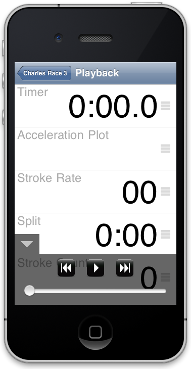
1. Our controls overview had several iterations, but we are very happy with how it turned out. The hide/show button was initially placed on the top navigation bar, which was inefficient and not intuitive. After our first computer prototype, we modified it and users found this much easier to use.
2. We decided to make the UI for using the playback screen exactly the same as the pre-race screen, so that users found it natural to drag rows and scroll around. The controls overlay didn't confuse anyone since it is clearly an overlay (the transparency give it the appearance of a window placed over the original view).
3. Our controls interface is very similar to the iPod controls, which improved learnability. Unfortunately, some users were confused at first by the slider; some thought it was for volume instead of a time-controller. Once they tried it once, they realized what it was and thought that the scrubbing was very intuitive and natural.
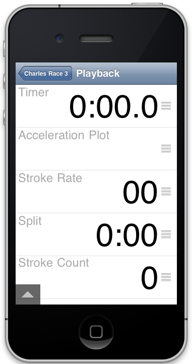
Playback Screen with navigation controls minimized
...
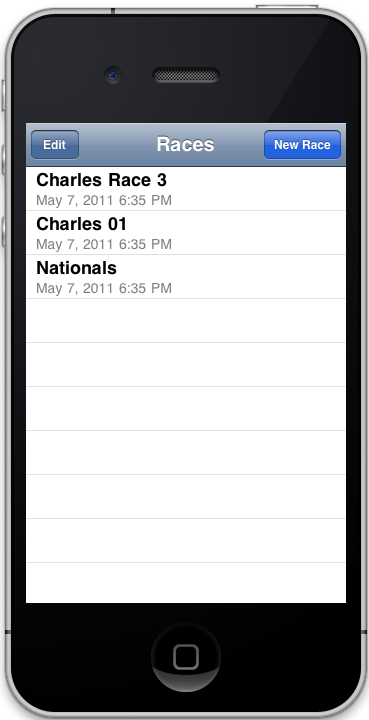
Back on Title Screen: New race shows up
...
Implementation
...