...
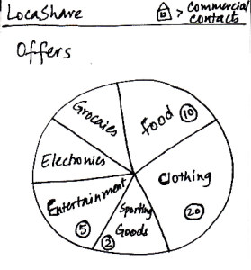
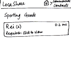
Task 3: View offers and opt-in to create commercial contacts: | Storyboard | Learnability | Efficiency | Safety | Visibility |
|---|---|---|---|---|---|
| Joe starts from the home screen and clicks | The numbers do not make sense as they are not labeled or defined on the screen. | Have to go through four screens to establish the commercial contact relationship. | If you over-share information, the only way to cancel that is by deleting the contact relationship. Not very efficient in that respect. | Options and controls are clearly visible. |
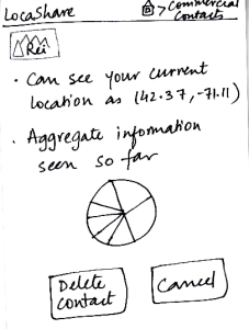
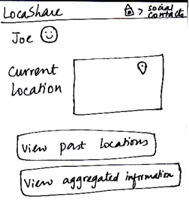
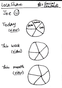
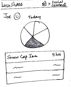
Task 4: View aggregate information of social contacts: | Storyboard | Learnability | Efficiency | Safety | Visibility |
|---|---|---|---|---|---|
| Since Alice wants to view Joe’s aggregate information, | The user would use the first two screens to view the current location as well, so this task is easy to understand. | Have to go through the same three screens to view the interested data. May be helpful to have hovering mechanisms. | No irreversible change can be done in this viewing task. | The graphs do not really convey interesting information. May be helpful to show the information on the fourth screen on hover (instead of clicking and going to another screen). |
Task 5: Edit social contacts: | Storyboard | Learnability | Efficiency | Safety | Visibility |
|---|---|---|---|---|---|
| Since Joe wants to modify the location permissions | The task is not very easy to learn in these two slides, since the bulk of the editing happens in the permissions screen. | May be helpful to have a "Cancel This Option" button beside the specific/aggregate information display. That way, the user does not have to go to the permissions screen to cancel aggregation option (for example). | No irreversible action possible in these two screens. | The data that the social contact (user's friend, for example) can see is very visible and easy to understand. |

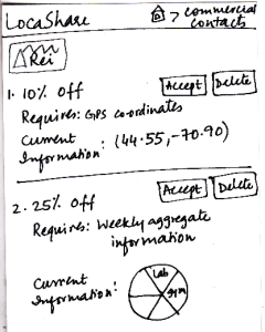
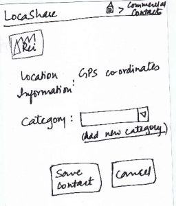
Task 6: Edit commercial contacts: | Storyboard | Learnability | Efficiency | Safety | Visibility | |||
|---|---|---|---|---|---|---|---|---|
| Since this task started with Joe seeing an offer from Rei, |
|
|
| The task is not very easy to learn in these two slides, since the bulk of the editing happens in the permissions screen. | May be helpful to have a "Cancel This Option" button beside the specific/aggregate information display. That way, the user does not have to go to the permissions screen to cancel aggregation option (for example). | What if the user wants to share a subset of information with Rei? This design describes an all-or-nothing approach. | The data that the social contact (Rei, for example) can see is very visible and easy to understand. |