Versions Compared

Key

  • This line was added.
  • This line was removed.
  • Formatting was changed.

...

Task 2: View real-time location of social contacts

Storyboard

Learnability

Efficiency

Safety

Visibility

    
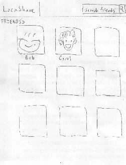
                   Home screen                     Find existing friend by either typing 
                                                                                     or browsing

    View Bob's location information

To view real-time location 
of a social contact, Joe 
starts from his home screen 
and clicks on "My friends". He 
can find his friends by either 
typing his name in the search 
bar of or browsing through the 
list of friends. 

He then clicks on Bob's picture 
to view his location information.
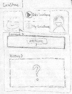
In Bob's page, the button
" > Bob's LocaShare" indicating
the location information Bob is 
sharing with Joe. Also, his
current location
is presented in
the "Current"
area (White Mt.
in this picture).

Browsing through past locations
can be achieved by swiping 
the current location map.

Pros:
1. This UI is consistent
with familiar social apps like
facebook. And the map 
widget is consistent with
the Google map.
2. Swiping to view past 
information provides good
feedback. 
Cons:
1. Swiping to view past 
information is not obvious 
to users; thus the interface
is not communicating itself
to users. An arrow or an
icon here could be helpful.
2. The swiping direction.
Does swiping left mean
viewing past histories? 
An arrow or some texts
would better explain this.
3. Do users understand the
difference between
"> Bob's LocaShare" and
"< My LocaShare"? We 
need to test this in paper-
prototyping.

Pros:
1. Once user find his/her friend,
viewing is simply one button 
click away.
Cons:
1. Swiping may not be the best
design if user wants to view the 
location information a long time
ago. However, the problem can 
be solved by showing a new 
page in which lists all the past
location information.


The current


Task 3: View offers and opt-in to create commercial contacts

Storyboard

Learnability

Efficiency

Safety

Visibility

      
Mail box notifies Joe that there are        Click on the mail box to view the 
             offers available                                  list of  available offers

  View Rei's offer by clicking on Rei 

The mail box animation pops up
when there are offers available
to Joe. Upon clicking on the mail
box, Joe sees the list of offers.

To view Rei's offer, he clicks
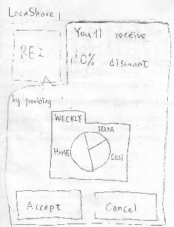
on Rei's picture and sees the
location information that Rei 
wants from him in exchange
for the 10% discount.

In this scenario, Joe realizes the
information he will be exposed 
to Rei by his own example.
LocaShare mines for Joe's
past locations and visualizes
the information he is about to
share. Joe can choose to 
"Accept" the offer or "Cancel" it.

Pros:
1. Mail box animation is 
a good metaphor for 
receiving a notification.
Joe can easily understand
that there are things 
available to him.
2. Joe can easily learn the
information he will provide 
to the Rei by his historical 
location information. Learn
by example my own example
is an effective way to teach
user what will happen if I
accept the offer.
3. The ">" button on each of the
offer item is consistent with
other smart phone apps which
indicates that there are more
detailed information.

Cons:
1. If the list of offers is long,
scrolling down the long list
might be cumbersome. 
Would be better to aggregate
the offers by grouping them
into various categories.

Errors can result by
 clicking "Accept" or
"Cancel" too quickly.
However, this can be
easily resolved by
providing an alert
menu to confirm with
user again. Besides, 
user can always
terminate this offer by
going to the "My deals"
page.

The mail box animation 
provides high visibility.

...

Task 4: View aggregate information of social contacts


The steps for this task is the
same as the steps for task 2.


Task 5: Edit social contacts


Bob's page and his location info.       The location info. Joe is sharing with      Permission setting of Joe for Bob              
                                                                                               Bob

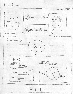
Joe enters Bob's page as in Task 2.
In addition to viewing Bob's shared
location with Joe, Joe can view how
Bob sees his location information by
clicking on the " < My LocaShare" 
button.

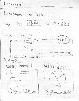
Joe modifies Bob's permission by
clicking on the "Edit" button at the
bottom and enters the permission
setting. The permission setting page
is the same as the on in Task 1.


...