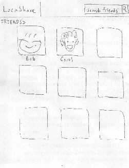 
Home screen Find existing friend by either typing
or browsing

View Bob's location information
| To view real-time location
of a social contact, Joe
starts from his home screen
and clicks on "My friends". He
can find his friends by either
typing his name in the search
bar or browsing through the
list of friends.
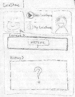
He then clicks on Bob's picture
to view his location information.
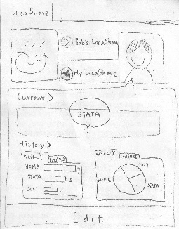
In Bob's page, the button
" > Bob's LocaShare" indicating
the location information Bob is
sharing with Joe. Also, his
current location is presented in
the "Current" area (White Mt.
in this picture).
Browsing through past locations
can be achieved by swiping
the current location map.
| Pros:
1. This UI is consistent
with familiar social apps like
facebook. And the map
widget is consistent with
the Google map.
2. Swiping to view past
information provides good
feedback.
3. Map widget provides
good affordance of the
location.
Cons:
1. Swiping to view past
information is not obvious
to users; thus the interface
is not communicating itself
to users. An arrow or an
icon here could be helpful.
2. The swiping direction.
Does swiping left mean
viewing past histories?
An arrow or some texts
would better explain this.
3. Do users understand the
difference between
"> Bob's LocaShare" and
"< My LocaShare"? We
need to test this in paper-
prototyping.
4. The question mark might
be misleading. Users
might think the system
doesn't function as
expected instead of the
location is unavailable. | Pros:
1. Once user find his/her friend,
viewing is simply one button
click away.
Cons:
1. Swiping may not be the best
design if user wants to view the
location information a long time
ago. However, the problem can
be solved by showing a new
page in which lists all the past
location information. | The only error here is not
viewing the desired data by
clicking on another friend's
picture. User can undo this
by going to the home
screen or the back button
on the browser.
| The map is big such that
users can see friends' current
location easily. |

