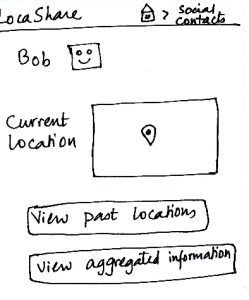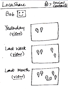
| Joe starts from the home screen and clicks on the
tab “Social Contacts”. He is then taken to the screen
shown here that can be considered the “Home
Screen” to handle his social contacts. Here, he can
(i) search for an existing social contact or (ii) add a
new one.
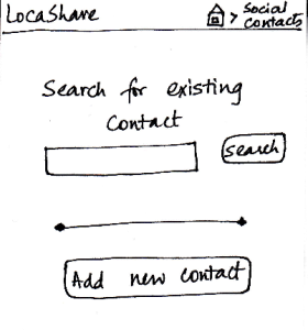
Since Bob is not on his contact list, he
selects “Add New Contact”. He is then taken to the
screen that shows the various settings he can use
to control the amount and type of his location
information that Bob can view.
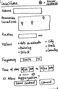
He can create settings according to
what he wishes to share (in detail or
in aggregate) with Bob. He
then clicks the button called “Save Contact”. He can
also cancel the form and start it again, if he wants to.
| Pros:
As in the other screens, the information scent is
strong because the user is able
to identify and keep track of which
part of the application she is in.
Providing the map option makes it easy
to learn and adapt since it is externally
consistent with apps like Google Maps and
gives the ability to directly manipulate.
Cons:
The screen does not indicate which
options are compulsory and which
may be skipped.
| Pros:
Since all the features are
clearly labeled, user can
set the
sharing options very quickly.
Cons:
The list of options may
seem tedious for many
users.
If the user wants to share
the same type of location
with multiple users, she
will have to enter the
same details all over
again. Aggregation of
location types may be
helpful.
| Pros:
Cons:
- Possible to make
mistakes and over-/under -
share
information.
Cons: Confirmation dialogs
may be helpful.
| Pros:
Controls are clearly visible.
Cons:
|