Versions Compared

Key

  • This line was added.
  • This line was removed.
  • Formatting was changed.

...

Task 1: Add Social Contacts:

Storyboard

Learnability

Efficiency

Safety

Visibility


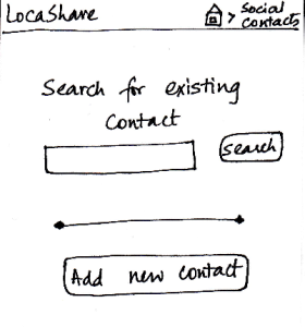
Joe starts from the home screen and clicks on the
tab “Social Contacts”. He is then taken to the screen
shown here that can be considered the “Home
Screen” to handle his social contacts. Here, he can
(i) search for an existing social contact or (ii) add a
new one.

Since Bob is not on his contact list, he
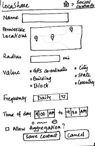
selects “Add New Contact”. He is then taken to the
screen that shows the various settings he can use
to control the amount and type of his location
information that Bob can view.

He can create settings according to
what he wishes to share (in detail or
in aggregate) with Bob. He
then clicks the button called “Save Contact”. He can
also cancel the form and start it again, if he wants to.

The breadcrumb trail helps the user navigate
back to home screen of the app or home screen
of the social contacts.

Pros:
As in the other screens, the information scent is
strong because the user is able
to identify and keep track of which
part of the application she is in.


- Providing the map option makes it
easy
to learn and adapt since it
is externally
consistent with apps
like Google Maps and
gives the ability to directly manipulate.
Cons:
The screen does - The map provides good affordances
and users can do direct manipulation
on it.
Cons:
- The screen does not indicate which
options are compulsory and which
may be skipped.
- The word "search for existing contact"
is misleading because it has both the
functionality of "search for existing and
new contact." 
- The "Add new contact" is inconsistent
with other social apps. It should come 
along with the contact instead of being
as a static button. Also, the search bar
location is inconsistent with other
social apps.
- The interface does not speak users'
language. Too many jargons are used
in the permission setting.
Pros:
Since all the features are
clearly labeled, user can
set the
sharing options very quickly  
- Lack of immediate feedback. Users
are unable to know what data they will
share with the settings. An example
here would be helpful.

Cons:
- The list of options may
seem tedious for many
users.

- If the user wants to share
the same type of location
with multiple users, she
will have to enter the
same details all over
again. Aggregation of
location types may be
helpful.
Or, the interface
should provide default/
recommended 
settings.

Pros:
Cons:
- Possible to make
mistakes and over-/under
share
information.
Confirmation dialogs
may be helpful.

Pros:
 
Controls are clearly visible.

Cons:

- The search results might 
cover the "Add new contact"
button.

- Duplicate search hints, that
is, "Searching for existing contacts" and
the "search" button.

Task 2: View real-time location of social contacts:

Storyboard

Learnability

Efficiency

Safety

Visibility


Once Bob adds Joe as a contact, Joe can
now search for Bob in his social contacts.
He sees the screen shown here that
indicates Bob’s current location (depending
on what Bob allowed him to view). Joe can
also choose to view historical locations
visited by Bob or Bob’s aggregated information.
On the similar screen on Bob’s application,
where Bob would be viewing Joe’s profile,
Bob would see that the button “View
Aggregated Information” would be disabled since
Joe did not allow Bob to view his aggregated
information.
Suppose that a month has passed since Joe
added Bob to his contact list. Joe can view Bob’s
historical data by clicking on the button called
“View Past Locations”. He would then see this
screen that shows Bob’s locations using markers
on three different maps. These three maps
correspond to a daily, weekly and monthly summary
of Bob’s locations (based on the permissions
that Bob set for Joe).

The breadcrumb trail helps the user
navigate back to home screen of the
app or home screen of the social contacts.

Pros: Once you


Cons:

The data presented
may be confusing
to some users.
What is the difference
between history
and aggregation?

Also, if the contact
visited the same place
multiple times a
day, would there be
a corresponding
number of
keyhole markers?


Pros:


Cons:
Lacks external
consistency with
other mobile apps.
The user
has to explicitly
search for the
contact to be able to
view location.
Would be better if there
was an
alphabetical list of
contacts
that the user could
scroll through.


Pros:

Cannot edit the contact's
information, so nothing irreversible can happen.

Cons:


Pros:
The most important
detail (current location) is
visible in an understandable
manner in a quick glance.

Cons:

...

Task 5: Edit social contacts:

 Storyboard

Learnability

Efficiency

Safety

Visibility


Since Joe wants to modify the location permissions
for Bob, he first searches for Bob on the “Home
Screen” for social contacts. After he comes to
Bob’s profile, he clicks on Bob’s icon/photo and
comes to this screen. Here he view the amount
and type of information that Bob can view about
<ac:structured-macro ac:name="unmigrated-wiki-markup" ac:schema-version="1" ac:macro-id="2fe9f1825543316a-45827e30-4a924d5d-a3fd9fa0-0061751082214194420b92fd"><ac:plain-text-body><![CDATA[him. [Note: Suppose that during the trip Joe
]]></ac:plain-text-body></ac:structured-macro>
allowed Bob to view his aggregated information.]
Joe can see that Bob can see his current location
as the lat/long in Cambridge, MA (his current
location). He also sees the pie chart/wheel that
describes the categorization of places that Bob
was able to view about him. He can now choose
to modify the permissions by clicking on the button
called “Modify Permissions” or can choose to
return by clicking “Cancel”. Once he clicks “Modify
Permissions”, he taken to the permissions sketch
described in task 1.

The breadcrumb trail helps the user
navigate back to home screen of the app
or home screen of the social contacts.

Pros:

Cons:

The task is not very easy to
learn in these two
slides, since the bulk of the editing
happens in the permissions screen.

He "clicks on Bob's icon/photo and
comes to this screen". How will users
figure that out on their own?

Pros:

Cons:

May be helpful to have a
"Cancel
This Option" button beside the
specific/aggregate information
display. That way, the user
does not have to go to the permissions
screen to cancel
aggregation option (for example).


Pros:

No irreversible
action
possible in these
two screens.

Cons:

Pros:

Cons:

The data that the
social contact
(user's
friend, for example)
can see is very visible
and easy to understand.

The control for editing
task is not visible at all.


...