Versions Compared

Key

  • This line was added.
  • This line was removed.
  • Formatting was changed.

...


Storyboard

Learnability

Efficiency

Safety

Visibility


Since Alice wants to view Joe’s aggregate information,
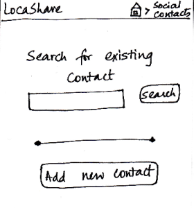
she first searches for Joe on her “Home Screen”
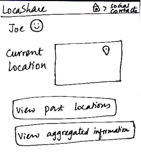
for social contacts. She then sees Joe’s profile as
seen in this sketch. At a glance, she can see that he
is near Sunday River and so she is relived that he
reached the resort safe and sound. When she clicks
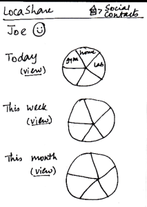
on “View Aggregated Information”, she sees the
following screen. She can see a summary of Joe’s
location on a daily, weekly and monthly basis. Instead
of a map view that showed Bob’s locations using
markers, in this aggregated view, Alice can see a pie
chart/wheel showing the amount of time Joe spent at
various places.
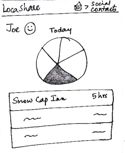
Alice can choose to drill down and get additional
details by selecting a wedge from the wheel. Suppose
 that she selected the category “Campground”
(shown as a shaded region), she can see a list of
places related to “Campground” that Joe has been
to and the amount of time he spent at each place.

The breadcrumb trail helps the user navigate back to
home screen of the app or home screen of the social contacts.

Pros:
- The user would use the first
two screens to view the current
location as well, so this task is easy to understand.

Cons:


Pros:

Have to go through three
screens to view the
interested
data. May be helpful to
have hovering mechanisms that
display necessary information to the
user without the need
to navigate through
so many screens.

Cons:


Pros:

No irreversible change
can be done in this viewing task.

Cons:


Pros:

Cons:

The graphs do not
really
convey interesting
information.
May be helpful to show
the information on the
fourth
screen on hover (instead
of clicking and going  to
another screen).

Task 5: Edit social contacts:

 Storyboard

Learnability

Efficiency

Safety

Visibility


Since Joe wants to modify the location permissions
for Bob, he first searches for Bob on the “Home
Screen” for social contacts. After he comes to
Bob’s profile, he clicks on Bob’s icon/photo and
comes to this screen. Here he view the amount
and type of information that Bob can view about
<ac:structured-macro ac:name="unmigrated-wiki-markup" ac:schema-version="1" ac:macro-id="c1da160704ab81dc-05e54901-4f79451d-92b8be97-f2289a37dd75da286ef1c073"><ac:plain-text-body><![CDATA[him. [Note: Suppose that during the trip Joe
]]></ac:plain-text-body></ac:structured-macro>
allowed Bob to view his aggregated information.]
Joe can see that Bob can see his current location
as the lat/long in Cambridge, MA (his current
location). He also sees the pie chart/wheel that
describes the categorization of places that Bob
was able to view about him. He can now choose
to modify the permissions by clicking on the button
called “Modify Permissions” or can choose to
return by clicking “Cancel”. Once he clicks “Modify
Permissions”, he taken to the permissions sketch
described in task 1.

The breadcrumb trail helps the user
navigate back to home screen of the app
or home screen of the social contacts.

Pros:

Cons:

The task is not very easy to
learn in these two
slides, since the bulk of the editing
happens in the permissions screen.

He "clicks on Bob's icon/photo and
comes to this screen". How will users
figure that out on their own?

Pros:

Cons:

May be helpful to have a
"Cancel
This Option" button beside the
specific/aggregate information
display. That way, the user
does not have to go to the permissions
screen to cancel
aggregation option (for example).


Pros:

No irreversible
action
possible in these
two screens.

Cons:

Pros:

Cons:

The data that the
social contact
(user's
friend, for example)
can see is very visible
and easy to understand.

The control for editing
task is not visible at all.


...