 | Joe starts from the home screen and clicks on the
tab “Commercial Contacts”. He is then taken to the
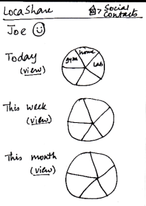
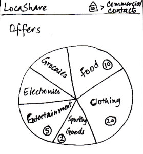
screen shown here that can be considered the “Home Screen” to handle his commercial contacts. Here, he can view various categories of products on a wheel.
Since Joe is at a ski resort and wants to buy some gear,
he selects the wedge titled “Sporting Goods”
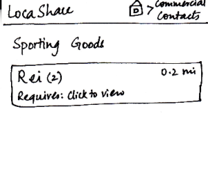
and is taken to the next screen that shows
him the list of stores selling sporting goods
and having offers.
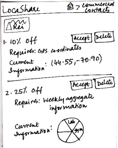
He can then click on the company providing
the offers and see the details of the offers.
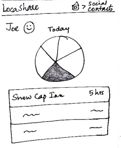
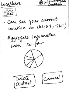
To help Joe understand the exact information
he would be sharing, LocaShare displays his
current information as an example.
Joe can choose to accept or delete the offer
by pressing the “Accept” or “Delete” buttons
respectively.
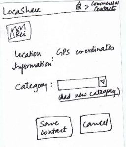
Once he accepts an offer, he would see a
summary of the information he is about
to share with Rei on the screen. He can
choose to create a category in which to
save Rei as a contact. He finishes the
process by pressing the “Save Contact”
button or cancel the offer by clicking “Cancel”.
The breadcrumb trail helps the user
navigate back to home screen of the app or home screen of the commercial contacts.
| Pros:
- Before confirming the relationship, the design gives feedback to the user about the location that will be shared.
Cons:
- The numbers in circles could be misleading. Are they based on the number of offers in that category?
- Would the wheel rotate when swiped? That would be the user's model of such a construct.
If the wheel is intended to be stationary, a list mechanism may be far easier to learn. Also,
what do the size of the wedges mean?
- What does the wheel chart in the third slide mean? Users do not have default sharing settings in this design and the user has not started sharing with Rei yet. The label should be modified to say "sample
information"
| Pros:
- The wheel analogy groups the offers and allows users to quickly navigate to the type of offer they are looking for. This avoid users from scrolling down on a long list to find a specific offer.
Cons:
- Have to go through four screens to establish the commercial contact relationship.
- Having a search mechanism will be helpful
since search is quicker than trying to locate a type of offer that does not neatly fit into any
pre-defined category.
| Users may
inadvertently over-share
information. The only way to
change this is by deleting the contact relationship.
Errors might also occur by clicking on "Accept" or
"Delete" too quickly. A confirmation
alert should be used here. | Pros:
The wheel structure displays the
major categories very
visibly.
Helpful information is presented in an
externally consistent
manner (e.g., distance from the user's location
to the store. this is
similar to how Google Maps
displays the location).
Cons:
- "Clicks to view" does not provide helpful information scent. |