 Image Removed Image Removed  Image Removed Image Removed
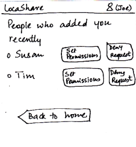 Image Removed Image Added Image Removed Image Added
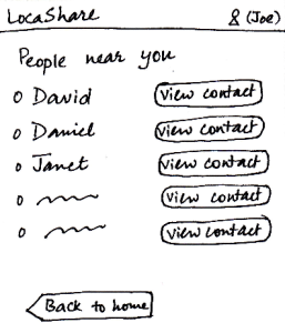 Image Added Image Added
Image Added
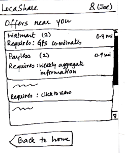 Image Modified Image Modified
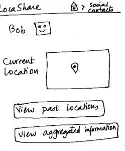
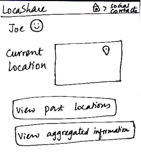
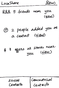
| When Joe starts LocaShare,he sees
the home screen shown in the figure.
* Upon clicking the link “view” near
(i), he sees the names of social contacts
that are near his current location. By
clicking on the button “View Contact”,
he can view further details.
* Upon clicking the link “view” near (ii), he
sees the names of people who added
him as a contact. The relationship between
Joe and that person (e.g., Susan) is not
established till Joe also adds Susan as his
social contact. By pressing the button “Set
Permissions”, Joe can add Susan to his
list. If he does not want to share his location
information with Susan, he can choose to
“Deny Request” and Susan would not be
able to track his location (since he will not
appear as her social contact). By selecting
either “Set Permissions” or “Deny Request”,
he can remove the person’s name from this
screen.
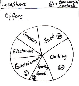
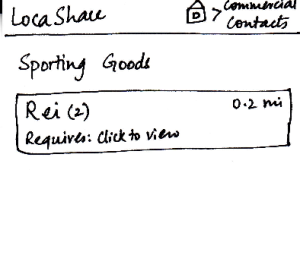
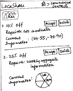
* Upon clicking the link “view” near (iii), he sees
a list containing thenames of stores that are
offering discounts or sales in exchange for his
location information.
In all the three cases, he can choose to return back to
the home screen.
| Pros:
- 1. Easy to learn where
to click and how to navigate by
providing texts on the labels.
- It is easy to learn how to
navigate because the
labels are self-descriptive.
It provides good affordances to
help the user understand what she
would see when she clicks on a link.
Cons:
Pros:
Easy to navigate.
Cons:
Pros:
Nothing
dangerous can happen.
Cons: However, it pays the price
of simplicity.
Cons:
- Back button at the bottom is inconsistent
with other mobile apps. The way
of receiving notification is also
inconsistent with other
social apps such as Facebook.
- The user interface uses
jargons (social/commercial
contacts and GPS coordinates)
which makes hard for
users to understand.
- Too many duplicate "View contact"
buttons. Instead, the interface should
use arrows (">") to be more consistent
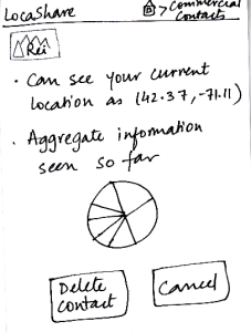
with other mobile apps. | Pros:
- Viewing social/commercial
contact requests can be done
in a single click.
Cons:
- If the list of contacts is long,
users need to scroll down on the long list.
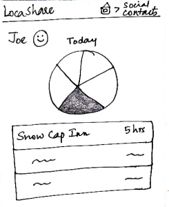
| The error here might be
viewing the wrong deal
or contact. Users can undo
this action by pressing the back button.
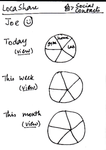
| Pros:
The most essential
capabilities are
directly visible.
Graphical representation
of what the task entails.
Cons:
However, only - Only numbers
are directly
visible, if you know
that
someone has
added you (if they
notify you), you
still have to click the
"view" link and then
acknowledge the
relationship.
- The "view" hyperlink
does not provide
enough information scent. |