Design 2:
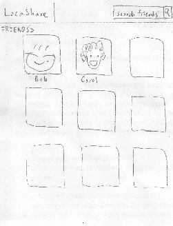
Home Screen |
|---|
...
| Storyboard | Learnability | Efficiency | Safety |
| Visibility |
|---|---|---|---|---|---|---|
| When Joe logs into the | Pros: |
|
Task 1: Add Social Contacts:
2. The user interface is | Pros: | If user wants to view deals | Pros: |
Task 1: Add Social Contacts | Storyboard | Learnability | Efficiency | Safety | Visibility | ||||
|---|---|---|---|---|---|---|---|---|---|
| |||||||||
|
|
|
|
| |||||
| To add a new social contact, |
|
|
| Show button. Click on the | Pros: | Pros: | Sources of potential | The clock widget, |
Task 2: View real-time location of social contacts |
|---|
...
|
|
|
|
|
|---|---|---|---|---|
|
...
Storyboard | Learnability | Efficiency | Safety | Visibility | |
|---|---|---|---|---|---|
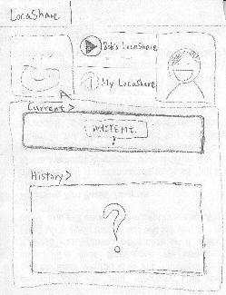
| To view real-time |
...
location |
...
Joe |
...
screen |
...
He |
...
either |
...
search |
...
or browsing through |
...
the | Pros: | Pros: | The only error here is not | The map is big such that |
Task 3: View offers and opt-in to create commercial contacts | Storyboard | Learnability | Efficiency | Safety | Visibility |
|---|---|---|---|---|---|
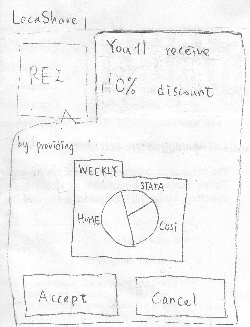
| The mail box animation pops up | Pros: | Cons: | Errors can result by | The mail box animation |
Task 4: View aggregate information of social contacts | Storyboard | Learnability | Efficiency | Safety | Visibility |
|---|---|---|---|---|---|
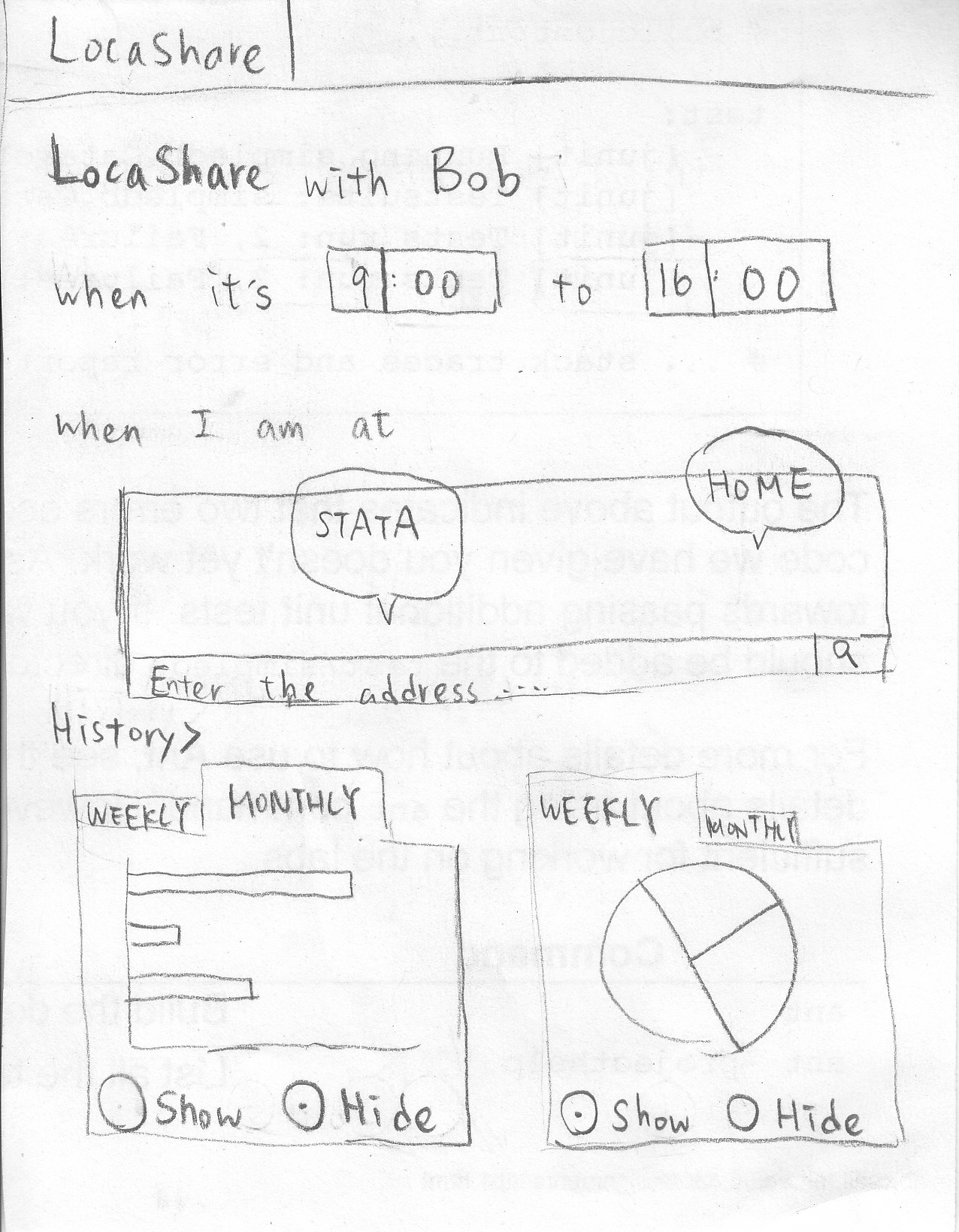
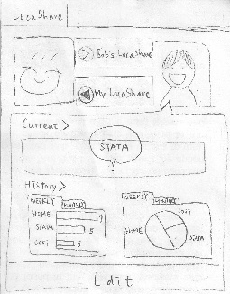
| The steps for this task is almost | Pros: | Pros: | The only error here is not | The tab menu and |
Task 5: Edit social contacts | Storyboard | Learnability | Efficiency | Safety | Visibility |
|---|---|---|---|---|---|
| Joe enters Bob's page as in Task 2. | Pros: | Edit can be done by | The only error here | The "Edit" button is salient |
Task 6: Edit commercial contacts | Storyboard | Learnability | Efficiency | Safety | Visibility |
|---|---|---|---|---|---|
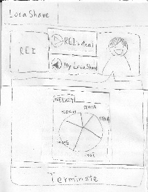
| To edit a commercial contact. | Pros: | Pros: | One of the errors might occur | The coupon information and |
...
|

