Design
Start Screen

1. We removed the login screen because we determined that it was an excessive feature (iPhones generally belong to one person, so chances are high iCoxBox will only have one user per app). This also removed the logo-like image we had on the splash screen (as it was also unnecessary).
2. We would have liked to have an alternative view for this screen that shows a map with all of the locations of past races to select from, so the user could essentially group and view past races by location, but in reality this happened to require far more technological overhead than it was worth.
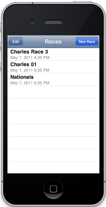
3. Races are now sorted by date rather than by title, a change from our GR4 computer prototype.
Edit Pressed @ Start Screen
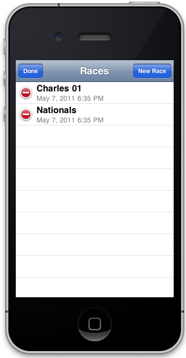
1. Here we used the standard iPhone UI affordance for editing and deleting entries in order to increase learnability.
"New Race" pressed -> New Race Screen
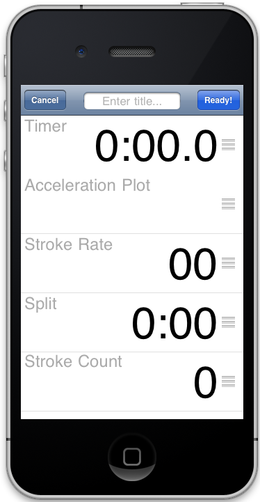
1. Title editing is intuitive, again via use of standard iPhone affordance.
2. Acceleration plot shows real time before race, instead of reading zero. (Note: This screenshot was taken with a device simulator, so acceleration plot is empty here, but would not be for a real user).
3. The dragging affordance used (the three dashes on the right of each row) were not as intuitive as we hoped; though again it is a standard iOS affordance, users did not seem familiar with it.
4. Large type makes data easy to read, even for a user who is at a further distance from the screen than normal (as the coxen will have the device mounted).
5. Early on, we thought users would want to save settings to use them for new races, but they showed little interest so we nixed the feature.
6. We also nixed the combined data rows because they are not normal iPhone affordances.
New Race Screen: Scrolled down to view lower elements
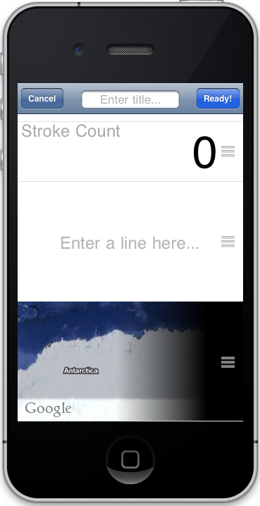
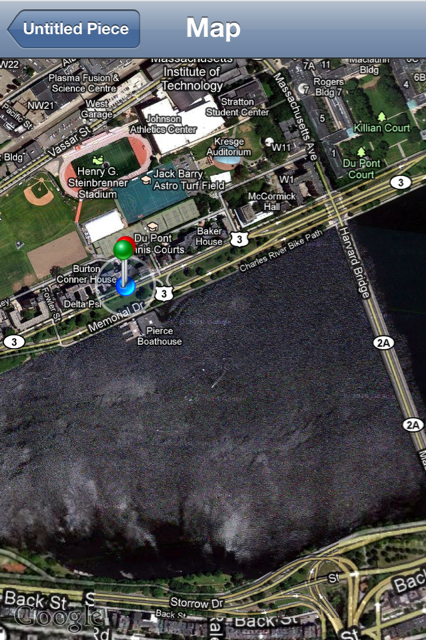
Note: Map is in Antarctica because the virtual device used to take this screenshot does not have actual location data to feed into the map. Normally this map is centered around the user's real-life location.
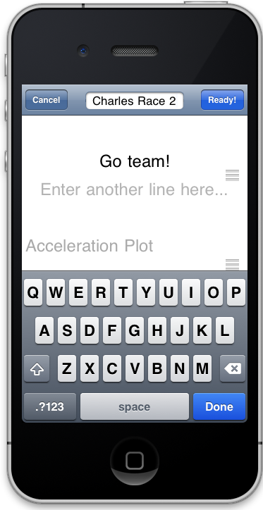
New Race Screen: Editing text
"Ready" Pressed @ New Race Screen -> Countdown timer
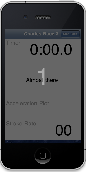
Countdown timer ended -> Live Race Screen
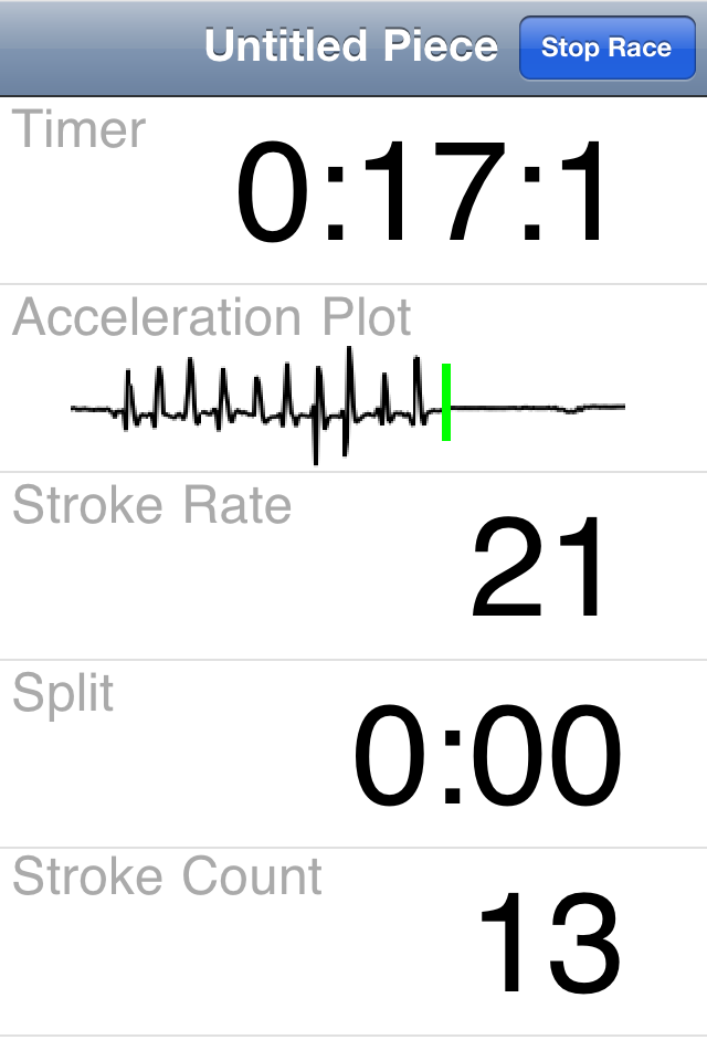
"Stop Race" Pressed -> View Past Race Screen

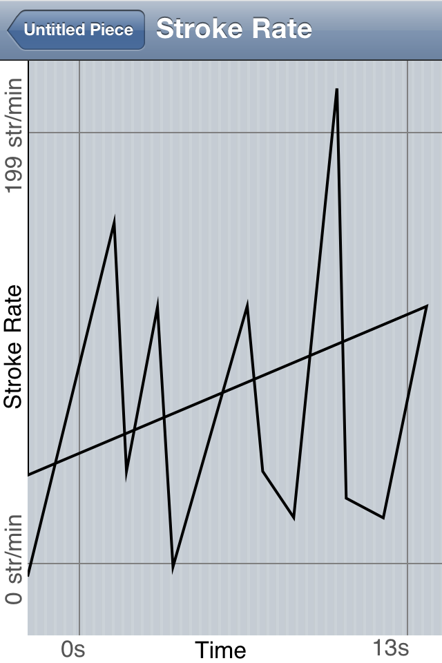
"Plot" for Stroke Rate pressed -> Stroke Rate Plot Screen
"View Map" Pressed from previous (View Past Race) Screen -> View Map Screen
"Playback" Pressed -> Playback Screen
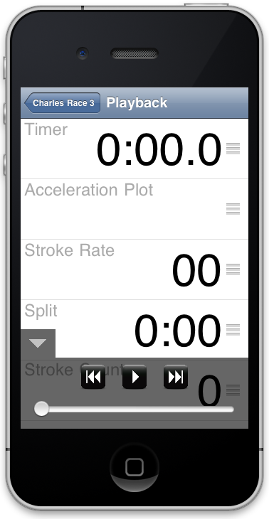
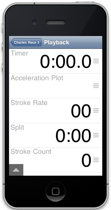
Playback Screen with navigation controls minimized
Back on Title Screen: New race shows up
Implementation
details
Evaluation
details
Reflection
All in all, our project was very well scoped and the user interface we settled on was a natural fit for the iPhone. We were happy with our designs and we picked the simplest; we wanted the user to know how to use it immediately and not have to relearn basic iPhone user interface affordances. Our paper prototypes worked well and were very useful in determining which features didn't work and which did. The medium of paper also made it easy to move around the UI when changes were necessary; for example we made the rows separate from the background (on the New Race screen) so that you could reorder the elements with ease and just flip them over when the race started.
Our computer prototype was not as useful as we thought it would be, but we did cut a few features after making it and rearranged several elements in the interface. We don't think that the lack of usefulness came because it was a low fidelity prototype, but simply because we had already located most of the problems with our UI in the previous stage of paper prototyping. From a design standpoint, building this digital prototype was probably just about as helpful as another iteration on our paper prototype would have been, but having a checkpoint for implementation was very helpful.
Our riskiest decisions were to include playback, maps, and acceleration plots (high technical overhead to include these features), but we managed to pull it off because a few of our group members were already sufficiently experienced in objective-c (the coding language used).