GR6 - User Testing
Design
Login Page
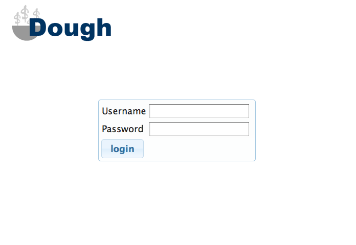
For the purposes of this class, we designed our login page to be minimalistic and efficient. This way, returning users would be able to log into the page and view information as quickly as possible. However, had this been a project we were trying to market to a wider audience, it would've been a good idea to include more information about what Dough is and how it works. Nothing on this page (except maybe the symbolism in the logo) says what services the website offers or entices new users to sign up. In fact, we did not even include a "sign up" function because it is common for new websites to only allow sign-ups through email for beta testing.
Home Page
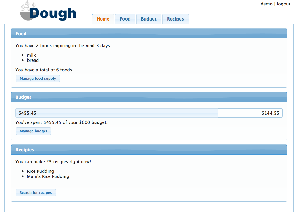
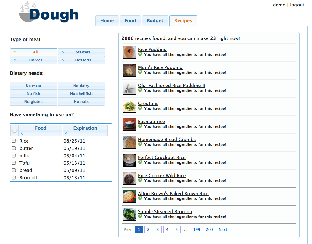
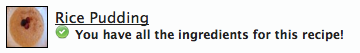
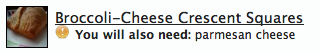
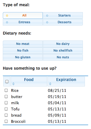
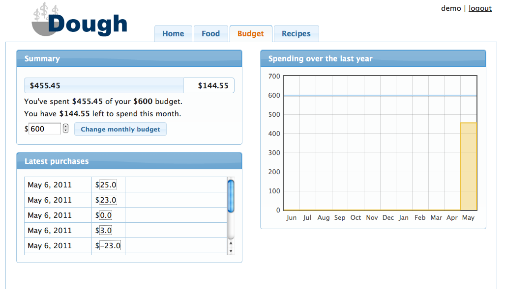
The layout of our homepage has not changed much through the different iterations of our design. We wanted to include a brief summary of each of the three areas of the website (food, budget, and recipes) to the user to improve efficiency. After reading evaluations of our computer prototype, we decided to reduce the width of the page content (on the homepage and all of the other content pages as well) to a specific number of pixels, and we centered this content on the page. This ensured that on high resolution screens, important information would still be easy to read (not stretched across the full span of the screen). As a result, the budget progress bar on the home page is much easier for the user to parse. Also as a result of our computer prototype, we made sure to turn the recipes listed under the "recipes" section into hyperlinks. This reduced the cognitive load on the user when trying to look for recipes because they did not have to remember the recipe name and then search for it on the recipe page. It was also suggested during paper prototyping to list both foods that are expiring and the total number of foods in the "food" section. We also decided to clarify what we mean by "expiring soon" by listing the actual time frame (3 days). This increases visibility.
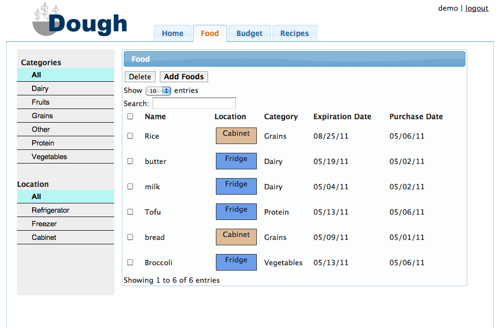
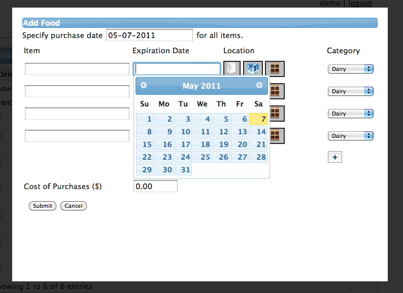
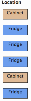
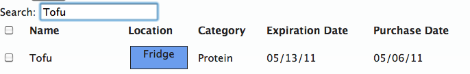
Foods Page

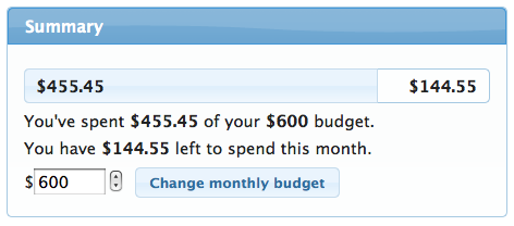
Budget Page
Recipe Page