Story (and analysis of each screen)
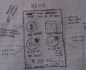
Jaden makes a purchase at 7Eleven for Pickbox. He opens the app and sees the home screen

|
*The icons on this home page easily convey the messages that when clicking the icons, either New Entry (sorry for the typo in the picture), View spendings, I owe You’s, You owe Me’s, or a graph should open. With quick reading at the top, users can figure out that if you hold down the icons, more options will be provided through a popup (as drawn to the sides). The home page displays a simple summary of expenditure for a preset time frame. The user will be able to make small changes to the fund and the time frame to see different values.
- There is a risk that the user will tap the numbers and nothing will happen. We could potentially make tapping the numbers the same as tapping the View Spending, since these numbers are a summary of the View Spending page.
- There is a small icon for displaying a graph, but depending on how the graph button is designed, it may not be recognized as a button that displays graphs, resulting in nobody using the button.
|
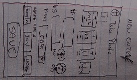
He clicks New entry to enter his spending.

|
- By keeping the Adding Icon similar to the Default Android images, there should be clear that by pressing the top line, users can take an image of their receipts. Taken/Uploaded receipts are lined up in a thumbnail so that users know exactly if the images have been successfully uploaded or not.
- The microphone and GPS buttons have the following functionalities: The microphone will use the Android’s built-in voice recognition system to fill in the amount spent and tags fields. The GPS will suggest past tags that have been used in the vicinity of the current GPS location.
- The microphone and GPS buttons may be confusing as there is hardly any description on them. However, hopefully, they will find out its capabilities by pressing it, as the motions required after pressing the button is minimal (speak when prompted, or choose from a list of tags).
|
He sees that the date is correct (as today’s date), and clicks the microphone button, and says “Eight Seventy Four at 7Eleven, Convenience Store.”
The input box to the price and tags fill up. Jaden, then, makes sure that the funds say Cash and moves on. He remembers that he should report it to Pickbox so that he can be reimbursed when he sees the button to make it into a “UOME”, and hits the button. This brings him to a similar screen, except now there is an empty field for who owes you.
 |
- The layout is kept as much as possible to be the same as the regular spending entries to reduce confusions.
- Users can preset which of your fund the payment will be made to so that when time comes, you can simply hit the check button from the list of UOMEs.
|
He clicks the contact book icon because he knows that he has the Pickbox’s reimbursement contact in there, and selects the contacts.
He then clicks the Share button.
Jaden also knows that Pickbox will direct deposit his reimbursement, so he selects the “Pay To” field as Bank.
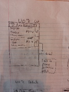
He hits save. Now he sees the UOME on the list of UOME’s.

|
- The layout is kept simple and concise. You will know who owes you for how much and since when. To the right, there is an un-high-lighted check mark which you can press to quickly mark that it has been paid to you. If you have not selected where the payment was going to be added to, there will be a simple pop up from which you can choose from.
- There is a problem that the user may accidentally hit the check mark before it has actually been paid. For that, users, with this design, will need to go to the list of expenditure and delete and modify necessary rows of transactions.
- (ADDITION) - On the top, there should be a " + Add New UOME"
|
Few days later, he is hanging out with his friend Pete, and stops at 7Eleven again to buy a pack of gum. Pete who wanted a bag of cookies, forgot his wallet, so Jaden decides to spot for him. After his purchase, he enters a new UOME, but this time, he leaves the Pay To field undefined as he doesn’t know how that will happen yet. When he has the app open, he sees a notice. The notice says that Pickbox had reimbursed him.
 |
- There are limited information on this page, which makes it easy to see what is going on.
- Although it is not colored on the sketch, important buttons, such as “Got It” and “Did not Receive” will be in green and red, respectively to further avoid errors.
- The page, at this stage, will not allow flexible payment amounts.
|
For now, he clicks “Wait”. When he returns home he looks at the confirmation receipt photo, checks his bank statement to make sure that the payment was actually made, and seeing that it is all good, he clicks “Got It!”.
Later that day, he goes to the Coop with his friend Eliza to buy textbooks. Because there was a giant line, Eliza decides to pay for Jaden’s stuff at the same time. Jaden makes an IOU entry.
 |
- This is very similar to, if not essentially the same as, the UOME list to avoid any confusion.
|
Jaden sees his IOU list has increased.
 |
- This pages is also kept essentially the same as the UOME page to avoid confusion.
- When the user hits Paid, the confirmation age will show up if the person you owe has an email address.
|
General Analysis
Overall this is a fairly simple design.
Items were placed in such a way that hopefully tries to anticipate people's actions (e.g.: assuming that the user won't actually


