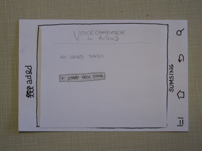
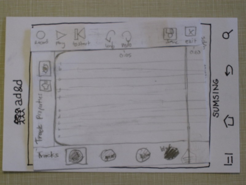
Prototype photos
|
When the program is first opened |
|
some text |
|
some text |
|
some text |
|
some text |
|
some text |
|
Hello, I am a greek motorcycle farmer. |
Briefing
Our project is called VoiceComposer, and it's intended to let users quickly record a melody they're thinking of onto their smartphone.
Scenario tasks
- Record a melody line.
- Change one of the notes in your melody.
- Add a harmony line.
- Export the song.
Observations
First design
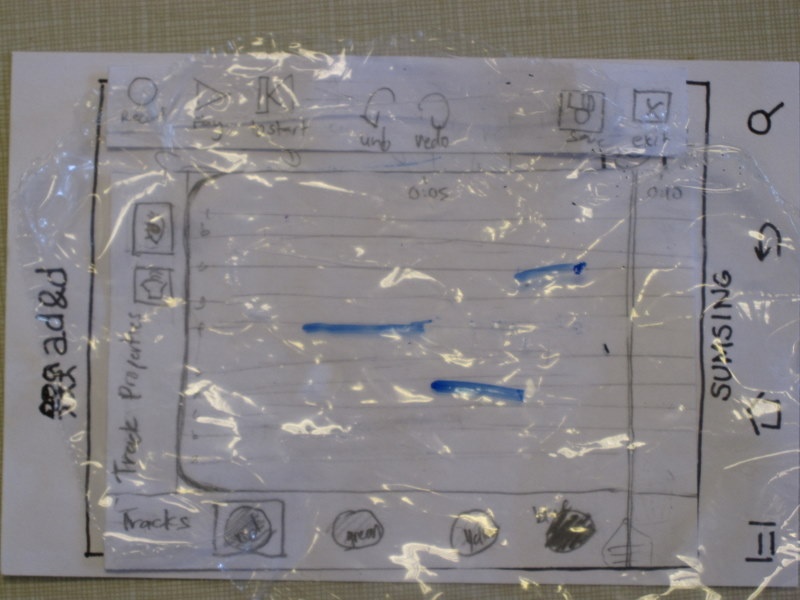
- There should be time markings along the screen, probably in increments of five seconds in so, so users can tell how far they are in the song.
- The "cut track" button that used to be in the menu bar was confusing, and no one figured out what it meant.
- We needed to work on how best to represent multiple tracks that would play simultaneously, given the limited screen space.
- People didn't want to tap "main menu" to exit the editing mode, because they were afraid it would discard their changes. We needed either some indication that the app was saving automatically, or an explicit "save" button.
- There used to be a button with a picture of a piano on it, which would change the instrument used to play a track. One user thought that such a button ought to display an on-screen piano keyboard, so that users could enter notes without having to sing into the microphone.
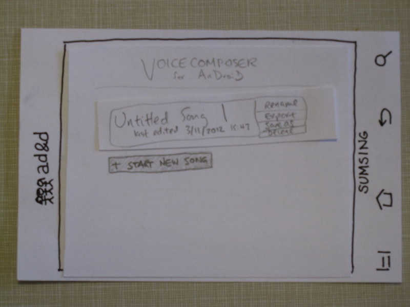
- The main menu should have functionality to duplicate a song, or copy it to a different name.
- The feedback for editing individual notes, particularly the indication of which note was currently selected, needed improvement.
- clicked on back to add harmony <-- what does this mean?
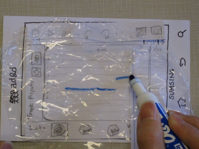
Revised design
"it's an eye?"
"this is clearly volume"
opened song to export
"export is tiny"
tapped on the layer buttons for a while before Record
used Undo to "change a note"
tried to drag a rectangle on the screen to select notes
should we make tapping on whitespace create new notes?
should we make dragging select multiple notes? vertical/horizontal?
recorded over layer before figuring out how to add harmony
should make "exit" say "menu" or something?
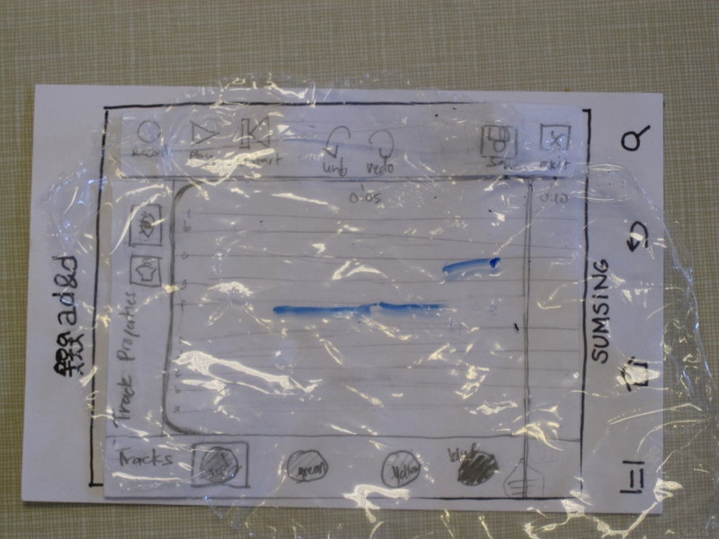
Prototype iteration
- Since users found the top menu bar confusing, we removed one of the buttons and replaced the "Main Menu" button with "Save" and "Exit" buttons.
- We decided that editing individual notes would be done through a modal overlay, so that users could use more of the limited screen space to swipe and drag.
- Audio editors commonly support arbitrarily many tracks, which can be moved around, created, and deleted. Our prototype originally used a scrolling list of tracks, but users seemed confused by adding and changing tracks. We replaced that with a layers metaphor where there are exactly four tracks that are overlaid on top of each other on the same staff.
- We added small time markings at the top of the editing screen, as suggested by users