GR6 – User testing
Table of Contents
Design
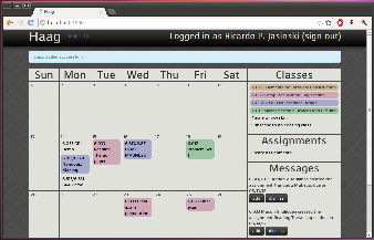
Our final design uses the calendar as a metaphor. The main view is divided into 2 regions:
- A large calendar, with a span of 4 weeks (previous, current, and the next two weeks).
- A sidebar, with links to the available actions and information that must be reviewed by the user. The sidebar is further divided into 3 sections:
- A list of subscribed classes. The list also does double-duty as a legend for the color coding used for the assignments;
- A list of actions available for working with assignments;
- A feed with messages generated by the system that must be reviewed by the user.
The screenshot below shows the main view of the application:
The most common tasks are adding an assignment and crossing an assignment off the calendar. To provide for better efficiency, there are multiple ways to add an assignment. Users may:
- click on a blank region on the calendar, to add an assignment for a specific date;
- click on a class same on the sidebar, to add an assignment for that specific class;
- click the self-descriptive sidebar link.
Because the assignments are shown directly on the calendar, a user can mark as assignment as complete in the simplest possible way: just click on the assignment, and it gets crossed off on the calendar. This action is revertible: clicking a completed assignment reverts it to the "due" state.
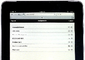
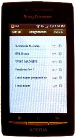
HAAG also features a mobile interface that is automatically loaded when the user logs in from a smartphone or tablet device:
|
|
Mobile interface on an iPad |
Mobile interface on an Android phone |
Changes made after Paper Prototyping
During paper prototyping, we determined that a mobile phone screen would probably be too small to implement a calendar view as rich as the one shown on the desktop. Therefore, we decided to implement the assignments view as a vertical list, keeping it simple, readable, and easy to interact with. The screenshots above demonstrate how assignments are show on the mobile interface.
Changes made after Heuristic Evaluation
- Improved consistency across dialogs: Based on a somewhat misguided guideline, we had implemented some actions of our dialogs using hyperlinks (e.g., 'Cancel'), and others using buttons (e.g., 'Save'). Our users complained, and we got rid of the links and adopted buttons for all dialog actions.
- Combined similar actions: Our users complained that the interface had similar actions (e.g., 'Create assignment' vs. 'Create multiple assignments') and that added some confusion, so we unified them into a single action ('Add assignments').
- Use attribute names consistent with the real world: In Ruby on Rails, it is common to name timestamp attributes using the suffix '_at". This surfaced to the interface, as a text field labeled 'Due at'. The evaluators requested it to be changed to 'Due on'. A similar problem happened with our implementation of a 'Class' object; because 'class' is a reserved word in Ruby, we had to name our structure 'Course', and it surfaced to the UI. Both issues were fixed.
- Added information about HAAG on the login screen: Some evaluators were concerned that it was not possible to know what the application does, so we added a short explanation on the landing page.
- Implemented missing features: We implemented the missing features from GR4, most of which were picked by the evaluators: allow unsubscribing from a class, implement undo for marking assignment as completed, and allow creating private assignments.
Implementation
Our application was implemented using the Ruby on Rails framework (version 3.1.3). For effects and widgets, we used the jQuery UI library for the desktop version, and jQuery Mobile for the mobile version.
Rails applications are structured according to a model-view-controller (MVC) pattern, and are expected to adhere to a series of guidelines. This "convention over configuration" philosophy benefits the designer by ensuring that if the guidelines are followed all low-level details are handled automatically. This allowed us to have the first several features running in a short time.
These two characteristics (MVC architecture and convention over configuration) greatly contributed to the implementation of the mobile version. In Rails, by registering a mime type 'mobile' and naming the views accordingly (e.g., 'edit.mobile.erb'), the framework will render the corresponding view when the application is accessed from a mobile device. This enabled the mobile version to be implemented with the addition of only 120 lines of code (7% of the application total).
One particular issue that required deviating from 'The Rails Way' is validation. Because we wanted to avoid full page reloads in order to enhance user experience, we implemented many input forms as modal dialogs. These dialogs are loaded inside a 'div', using jQuery UI methods. When a user sees a modal dialog on top of another page, this is actually the result of two distinct page loads. Being essentially stateless (unless enough hacks are provided), the server cannot re-generate this same view with a single page reload. For this reason, it is not possible to display error messages on a dialog, if we striclty adhere to Rails conventions.
The solution adopted was live validation with AJAX requets. Whenever an input field changes, a round trip to the server is performed, and if the field contents are invalid they are highlighted in red. This added significant complexity, but from the user viewpoint it was probably worth it: in the one case where we faild to implement live validation, an evaluator classified this as both a major problem (lack of feedback) and a minor one (inconsistent layout). These issues were fixed in the final implementation.
Evaluation
We found three undergraduates to participate in user tests. One has a calendar with all of her assignments for the entire year, one makes a list for each upcoming week, and one just keeps everything in his head. We managed to test someone who matched each of our original user scenarios.
To start the test, we opened up the homepage and gave this briefing:
This is HAAG, a collaborative calendar. If one student creates a calendar for her class, other students can subscribe to the feed. The entire class can have an up-to-date list of assignments, without everyone having extraneous duplicate work.
We gave each user 7 tasks:
- Sign up for an account
- Even though the sign up button was not on the homepage, all users rapidly found it.
- 2 of the 3 users entered a password that was too short, and had to go through the form a second time.
- Go add 18.03 to your calendar. The assignments are: PS1 on the 11th and PS2 on the 16th.
- None of the users had trouble creating the class.
- 2 users entered "18.03" as the class name, while the third put in a more descriptive name.
- 2 of the 3 users entered assignments by clicking on days in the calendar; the third used the "New Assignment" button on the right.
- 1 user was impatient and clicked the submit button twice. This resulted in two new assignments on the page.
- Your 6.033 TA told you that he created a feed for all of the 6.033 assignments. Find and add his feed.
- 1 user has a moment of hesitation before finding which link to click, whereas the other two found the link quickly and had no trouble at all.
- You finished PS1 for 6.813 – go and mark it as completed.
- None of the users had trouble with this step.
- One user remarked that she really liked the quick animation between active and completed.
- You later remember that you weren't actually finished with PS1 – mark it as unfinished.
- There was often a slight hesitation after this was said – likely because it's not a common action, and therefore took a moment to parse.
- All users were able to complete the task without further prompting.
- You decide to add a personal assignment, "Reading: Learning Java," to 6.813. Go add it to your schedule for the 13th.
- All users created the assignment correctly, making sure to remove the "shared" check-box.
- One user searched for the check-box before entering the name of the assignment.
- Users entered this task with a goal. If they didn't know this feature existed, it may have taken longer.
- Later, when away from your computer, you finish the Java reading. Go on your phone and mark it as completed. (We switched users to the mobile version for this question)
- While users didn't have trouble with this task, it took them a moment to scroll through all the tasks to find the correct one.
- Sometimes there were multiple assignments with the name name (i.e. "Reading").
The usability tests brought forth a few issues:
- (Minor) There was a small bug where we didn't have the correct information in the header bar (i.e. a section was blank)
- We already fixed this with a quick patch.
- (Major) Users were much slower on the mobile version. This is a concern, especially since the primary goals of the mobile interface were convenience and efficiency.
- We should label assignments with both the color and name of the class.
- Really old assignments could be moved to the bottom of the list in order to show more recent ones.
- (Minor) "Shared" may be confusing without the prompting of the usability test.
- We could replace the "Shared" check-box with a radio button between "Private" and "Public."
- (Cosmetic) The colors chosen are sometimes too similar.
- One approach would be to allow users to choose their own colors.
- We could also create a more sophisticated algorithm for choosing distinct colors.
Reflection
During the iterative design and implementation process, we came to some conclusions that can be generalized and may be useful for future projects.
First, although obvious in retrospect, users do not always use the interface as originally intended. We observed this during paper prototyping: users would frequently click on a class name when we asked them to create an assignment. We decided to embrace it, and this shortcut was implemented in our final design.
Second, before adding UI effects that are not included with the standard framework, or that deviate from conventional web applications, it is worth evaluating how much value they really add to the interface. In the time we spent implementing live validation, it could be possible to implement several other features.
Third, it is worth mentioning that most problems identified during heuristic evaluation were actually implementation faults; this is an indication that major design problems were probably filtered out in earlier paper prototyping sessions - which are faster and cheaper.
Finally, we observed that users expect to experiment with the interface without facing irreversible consequences. We frequently saw users clicking everywhere on the UI, when they got stuck with the task at hand. There was also visible frustration when an action lead to a consequence that could not be easily reversed. Of course they are right, and it is our job as designers to create interfaces that match their expectations.


