GR6 – User testing
Table of Contents
Design
Our final design uses the metaphor of a calendar. The main view is divided into 3 regions:
1. A large calendar, with a span of 4 weeks (previous, current, and the next two weeks).
2. A sidebar with the list of subscribed classes. The list double-duties as a legend for the color coding used for the assignments.
3. A sidebar with a list of messages generated by the system or sent
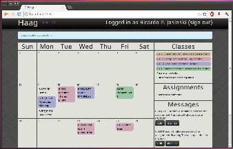
Calendar
The calendar uses the most
List of Classes
Messages Feed
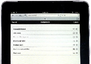
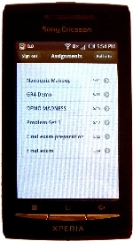
Mobile Interface
iPad
Android:
Implementation
Evaluation
We found three undergraduates for the user tests. One has a calendar with all of her assignments for the entire year, one makes a list for each upcoming week, and one just keeps everything in his head. We managed to test someone who matched each of our original user scenarios.
To start the test, we opened up the homepage and gave this briefing:
This is HAAG, a collaborative calendar. If one student creates a calendar for her class, other students can subscribe to the feed. The entire class can have an up-to-date list of assignments, without everyone having extraneous duplicate work.
We gave each user 7 tasks:
- Sign up for an account
- even though the sign up button was not on the homepage, all users rapidly found it
- 2/3 users entered a password that was too short, and had to go through the form a second time
- Go add 18.03 to your calendar. The assignments are: PS1 on the 11th and PS2 on the 16th.
- No users had trouble creating the class
- 2 people entered "18.03", one put in a more descriptive name
- 2/3 users entered assignments by clicking on days in the calendar, the third used the "new assignment" button on the right
- 1 user was impatient and clicked the submit button twice. This resulted in two new assignments on the page.
- Your 6.033 TA told you that he created a feed for all of the 6.033 assignments. Find and add his feed.
- 1 user has a moments hesitation before finding which link to
- The other two found the link quickly and had no trouble at all
- You finished PS1 for 6.813 – go and mark it as completed.
- No users had trouble with this step
- One user remarked that she really liked the quick animation between active and completed
- You later remember that you weren't actually finished with PS1 – mark it as unfinished
- There was slight hesitation after saying this – probably because it's not a common action, and it took a moment to parse
- All users did this without further prompting
- You decide to add a personal assignment, "Reading: Learning Java," to 6.813. Go add it to your schedule for the 13th.
- Everyone created the assignment correctly, and removed the "shared" checkbox
- One user searched for that box before entering the name of the assignment
- Users entered this task with a goal. If they didn't know this feature existed, it may have taken longer
- Later, when away from your computer, you finish the Java reading. Go on your phone and mark it as completed. (we switched users to the mobile version for this question)
- While users didn't have trouble with this task, it took them a moment to scroll through all the tasks and find the correct one
- Sometimes there were multiple assignments with the name name (i.e. "Reading")
The usability tests brought forth a few minor issues:
- There was a small bug where we didn't have the correct information in the header bar (i.e. a section was blank)
- We already fixed this with a quick patch
- Users were much slower on the mobile version
- We should label assignments with color & name of the class
- Really old assignments could be moved to the bottom of the list to show more recent ones
- "Shared" may be confusing without the prompting of the usability test
- We could replace the "Shared" checkbox with a radio button between "Private" and "Public"
- The colors chosen are sometimes too similar
- One approach would be to allow users to choose their own colors
- We could also create a more sophisticated algorithm for choosing distinct colors