Design
EasyShop is a website that is meant to make shopping easier for the elderly as well as those with poor eyesight. What makes our website more desirable to elderly people is our emphasis on customer service, our sites ability to change the sizes of search results, and general minimalistic style.
What we learned from:
Paper prototyping
- The information scent given by our re-sizing icon and slider was not strong enough => We put a label on the slider and icons to make use of the slider more intuitive.
- Checkout button was hard to find because the icon was too small and it was away from any center of focus => We moved the shopping cart to the area close to the user information drop down
Heuristic evaluation (feedback we got from class)
- The main page was way too busy with the colored images => We replaced those images with simple icons that are consistent and commonly used
- Paypal is too different from our web site and leads to local inconsistency => We implemented Stripe for checkout system which is much simpler and has the same styling as our website
- For your reviews, there is not enough distinction between the review and the review title => Made a bigger distinction by implementing a review system that clearly distinguishes the title from the actual content
- The number system is probably not the best visual variable for reviews => We implemented a system that uses stars which are much more common
Walk-through
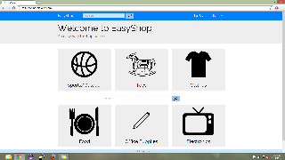
Main page. Consists of big icons for major categories of items in our database. There are not only visuals for the categories but also titles. They somewhat resemble the cards that are used in Google Now which give the affordance of being clickable while also clearly separating all of the icons.
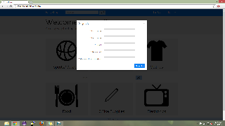
Sign up page. The sign up page is a simple modal that requires the user to enter their first name, last name, email address and password. We decided to make this a modal instead of another page, because it was more simple and also lessens the possibility of mode error.
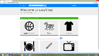
Successful sign up. In order to inform user that they have signed up successfully, we not only prominently show their name in the upper right hand corner, we also show a message with a green background stating that the sign up was successful. While this might be too much feedback for the average user, for our user population, the elderly, we want to make sure they always know what is going on.
Implementation
We decided to make our website a ruby-on-rails based system. The site is hosted on Heroku and the best browser for it is Chrome. We use a lot of outside libraries for various reasons including Sunspot(search), Stripe(payment), and Rake(database). Our back-end consists of models for items, users,
**Andrew would know how to answer this best**
Problems
- We lost a lot of crucial time dealing with development issues in the beginning of the implementation process. Computers that were running on Windows could not be used to develop and eventually we had to start booting Ubuntu from flash drives
- Scripts was not working, so we had to host on Heroku and in order for our back-end to work, we had to pay $20
- While developing, our ".gitignore" file was being buggy and would not ignore certain files making pushing and pulling a hassle. Eventually we got it to work.
Evaluation
Briefing
Thank you for helping us test our shopping site for the elderly. We will be asking you to perform a series of tasks to test the usability of our website. We are not allowed to aid you in the completion of the tasks and we ask you to please think out loud while you are completing these tasks. Sometimes when people concentrate on something they forget to think out loud, so please be aware of this and we will remind you if needed. The more we know about what you want to do and what you think something should do, the better off we are. Remember that you can stop at any time and feel free to ask us any questions after you the test.
Scenario
You are an elderly person that is buying a basketball for your grandson for his birthday.
Tasks
Please do the following tasks:
- Make an account
- Search for basketball
- Re-size search results to "small", then "big"
- Pick Spalding basketball
- Check reviews
- Add to cart
- Checkout
- Pay with following fake information:
- Card number: 4242 4242 4242 4242
- Expiration: 07/17
- Name on card: "your_name"
- CVC: 123
- Got to your profile page
- Under purchase history, select the basketball you purchased
- Give this item a review
User 1
User 2
User 3
Reflection
What we learned
Over the iteration process, we learned the following:
- Things that might seem simple because you see them in your everywhere in you daily life might not be so simple. For example, a simple shopping cart can be very difficult to implement depending on you website's back-end.
If we could do it again
Looking back, we should have obviously started sooner, but you can say that about every project. One problem that