
Group Members
- Stephen Suen ssuen
- Kathy Fang kfang
- Yi Wu wuyi
- Connie Huang connieh
- TA: Katrina Panovich
GR1 - User and Task Analysis
GR2 - Designs
GR3 - Paper Prototyping
GR4 - Computer Prototyping
GR5 - Implementation
GR6 - User Testing
GR6 - User Testing
Design
The final design of our interface included the following components:
Landing Page: This page, shown in Figure 1, introduces the purpose of our application and links users to the registration process.
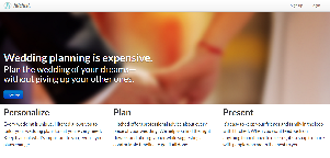
Figure 1: Landing page
Choosing initial wedding tasks: This is one component that was changed drastically since the first prototype of our design. We received complaints during both the paper prototyping and heuristic evaluation that the users were overwhelmed by the number of wedding tasks (and unsure of what each meant and if they could change them later) and thought that it cluttered the initial registration process. There were too many “big decisions” to be made (i.e, whether to include a bridal shower) without enough information about how to make the best choices. Heuristic evaluators thought this process was very overwhelming and were unhappy with the lack of batch operation tools. We chose to take out this step from the registration stage and separate it into a settings page. Now, we pre-populate the wedding tasks and let users adjust them well after they register.
Choosing wedding date during registration: Although we took out the step for users to chose their wedding tasks in the initial registration process, we kept the step for users to chose their wedding date, shown in Figure 2. From our interviews with engaged couples, we found that they start planning a wedding only after setting the wedding date. Thus, we anticipate our users knowing their wedding date at the time of registration. On the page where users select their wedding date, we also decided to include a list of popular holidays. During paper prototyping, some users expressed concerns about their wedding date overlapping with important religious and national holidays. If users are unsure about their wedding date or want to change it at a later date, they can always do so from the settings page. This gives the user control and alleviates safety concerns.
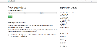
Figure 2: Users choose their wedding date during the registration process
Timeline view on the dashboard: Other alternatives to the timeline included a calendar, nested timelines, and check-list. We brainstormed these alternatives when doing individual sketches before making the paper prototype. Ultimately, we decided to use the timeline for our paper prototype because we believed that it would be the least complex, easy-to-understand representation once implemented on the computer. The timeline allows users to visualize the due dates of tasks (making it better than a check-list). It also does not provide unnecessary clutter on the screen (making it better than a calendar). We chose a timeline rather than a nested timeline because the ability to filter events appearing on the timeline serves the same purpose as a nested timeline. During the paper prototyping stage, our users found the timeline tricky to understand because they were unsure of how responsive it would actually be. However, they agreed that the timeline allowed them to easily identify the timing of wedding tasks. From the heuristic evaluation, we reduced the unused vertical space of the timeline, and introduced a “stacked view” for easier visual differentiation between categories. We also have a "combined view", which allows users to see the timing of tasks across multiple categories. Figure 3 shows the "stacked view" and Figure 4 shows the "combined view". Our paper prototype users had difficulty finding certain tasks on the timeline. As a result, we added a filter function to allow users to find events based on category. Figure 5 illustrates this filter feature. In our computer prototype, we implemented the ability to drag events on the timeline (in order to change their date), but our testers found this drag feature to be unintuitive. We decided to eliminate this feature. Instead, as shown in Figure 6, users can change the date of an event from the "edit event" page (accessed by clicking on the event from the timeline).
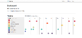
Figure 3: Stacked view of the timeline
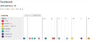
Figure 4: Combined view of the timeline

Figure 5: Filter feature on the timeline
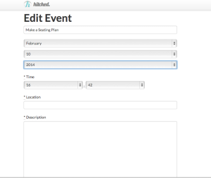
Figure 6: Edit event page
Event list view: This feature, shown in Figure 7, was added as a result of the heuristic evaluations. We received comments about having a centralized list of all the tasks associated with the wedding. User testing showed that this was a good decision because users liked the ability to view all events and corresponding descriptions without the hassle of having to go to each event page separately.
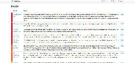
Figure 7: Event list view
Comments: When we interviewed individuals from our user population, they told us that they wanted a comprehensive wedding planning tool, one that they could use to post pictures, get feedback from friends/family, and link to Pinterest. We thought that such an application would be too difficult to implement given our time constraints. However, we think that the ability to communicate the timing of events with friends/family is key to wedding planning. Therefore, we implemented a comments feature, allowing users to comment on each event. This feature is shown in Figure 8.
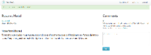
Figure 8: Comments feature on an event page
Implementation
We used HTML/CSS/jQuery and a number of javascript libraries including D3 and Ruby gems including simpleform. To structure our content we used Bootstrap. We used Rails to implement our back end. Our system utilized four basic models: User, Wedding, Event, Comment. Establishing the relationships between these models early on helped us structure the rest of our content and how we chose to display it (e.g. a User has one Wedding, and a Wedding has multiple Events).
We found that using the default routes rails provides when you construct multiple views made it easier to separate some tasks into different screens instead of using modals (e.g. the Edit Event interface). This may be less efficient for the user (due to the increased number of pages/clicks required) but provides more feedback because navigating through different pages and receiving flash confirmation messages signaled to the user that changes were made.
Although we thought of a number of different ways to view all the events a user would encounter, we ultimately decided to create a timeline view and a list view. To prevent information overload on the dashboard page, we pulled out the unread comment section and gave it a standalone page. As with the Edit Event interface, this reduces efficiency but has the benefit of keeping the dashboard experience focused on the timeline and increasing overall readability due to the reserved page space.The jbuilder gem renders the events of each wedding as a JSON object that feeds into the timeline interface. We originally relied solely on the timeline view to display information to the user, but during the implementation process we displayed an unstyled list of events to easily see what was in the database. We found this feature so helpful that we decided to implement it as part of the user interface as well. This allows for greater efficiency in finding a specific event and supports list-oriented users in addition to visual users.
Evaluation
Users
We tested the completely Hitched website on three different users:
- User 1 is a group member’s friend from the University of Michigan who got engaged about 6 months ago.
- User 2 is a MIT senior who got engaged last week and is a member of our sorority, Kappa Alpha Theta.
- User 3 is a 22-year-old friend from the University of Arkansas who just proposed to his girlfriend.
We interviewed both females and males because our application is designed to be gender neutral. All three users are representative of the target user population because they are in the process of planning a wedding. They are also college students on a budget and do not plan to hire a professional wedding planner. For the MIT student, we conducted the user test in person. For the other two users outside of MIT, we conducted our user tests over Skype so we could observe their reactions and take notes during the test.
Briefing
Before they were directed to our website, the users were briefed with the following:
“Many brides-to-be plan their own weddings without the help of a professional wedding planner for financial reasons. The aim of our app is to provide comprehensive guidance on the scheduling of tasks and events related to the wedding. Additionally, the app allows involved parties, such as family members, to provide their opinions during the wedding planning process.”
They were then asked to perform the following tasks:
1. Register for Hitched, including inputting their wedding date
2. Change the date and description of Edit Guest List event.
3. Add a comment to Set Up A Registry.
Usability Issues
After the three user tests, we discovered a small number of usability problems that are worth noting. Below we list the problems as well as possible solutions:
- Users wanted an indicator to show when tasks are complete. Possible solutions include adding a completion checkbox in the list view, an unfinished/finished field on the event page, or making the event a different color on the timeline (i.e, greyed out) when it is completed.
- Users were frustrated at having to go to a separate page to edit event details. This is an efficiency issue. A possible solution is to allow users to edit commonly changed fields of events (i.e, date/time) by hovering over the event on the timeline, rather than clicking through to the edit event page.
- Users found it difficult to locate events on the list view. Currently, all the events in the list view are displayed at once. Although events are grouped by categories, users cannot choose a subset of categories to view. One solution is to allow filtering of the list view, much like the filtering of the timeline view. Another solution is to implement a search feature that allows users to search the list view for a specific event
- Users wanted the ability to add their own event. Two out of three of our users asked if they could add their own event to the timeline/list view. We decided not to implement this feature because our application is designed for users with little wedding planning experience, and we wanted to guide them through the process. We included all the major wedding planning tasks found on professional sites like theknot.com, so we did not foresee users adding additional tasks. However, in future iterations, we could include this feature to increase user freedom and control.
- When selecting a wedding date, users wanted to see the dates of the holidays. Currently, we only show a list of the holidays but not the dates. It would be useful to list the actual dates to help users make sure their wedding dates don't overlap with holidays.
- Users wanted to see the day of each event. Currently, we only show the date but not the day of the week. This information would be useful to figure out business hours of certain vendors.
Reflection
The iterative design process taught us the importance of being flexible with our design, prototyping, and testing with users.
Flexible Design
Throughout the prototyping and user testing process, we all realized that we need to continually adapt our design based on feedback from other team members and users. Initially, we each had different design ideas and prototype sketches. After evaluating the pros and cons of each design alternative, we created a paper prototype that incorporated the most user-friendly aspects of our different designs. This process showed us the power of brainstorming as a group and coming up with a collaborative design. Similarly, each round of user testing showed us issues that we had previously not considered. For example, users struggled to use certain features (such as dragging events around on the timeline) and suggested that we build additional features (such as a list view of events). As a result, we changed our design to increase learnability, safety, and efficiency at each iterative step. This required many frequent changes to our design. Hence, we learned that we should adjust our design (making both small and large changes at each iteration), rather than be set on a specific design.
Paper Prototyping
In addition, we learned about the usefulness of paper prototyping. None of us had ever used rounds of prototyping to build an application, so we were initially skeptical of how effective prototyping could be. However, after our first paper prototyping round (with other 6.813 students in Walker Memorial), we were convinced that prototyping could generate many useful comments. Even though our paper prototypes were primitive, in that a group member served as the back-end and some features were roughly sketched out, we still received valuable user feedback on the layout and progression of our screens. We found the most difficult part of paper prototyping to be creating a realistic experience for the user. Many features easily implemented on the computer (such as drag/drop, drop down menus, etc), were difficult to replicate using paper. As a result, we found that paper prototyping was the most useful for helping us make broad design choices, such as choices on the overall setup and layout of key features (i.e, comments). In the paper prototyping stage, we chose to prototype all the layouts of our main pages, including the registration & select events page, timeline, event page with comments, and edit event page. However, we did not fully prototype certain features that required more extensive back-end. These un-prototyped features were (1) adjusting the timeline after the user edited an event, (2) showing dates as the user dragged an event around on the timeline, and (3) populating the timeline based on the user’s selection of which tasks to include.
Computer Prototyping & Heuristic Evaluation
Computer prototyping, on the other hand, provided useful feedback on both broad features and detailed design issues. We prototyped all of the front-end for our design, but gave users canned responses because we did not prototype the back-end. Specifically, as mentioned in GR4, we allowed users to edit events and add comments, but these edits were not stored in the back-end and thus disappeared after the user refreshed the page. We also did not prototype the back-end of the registration system, so users who created logins could not login with those credentials. Our timeline was pre-populated with events, instead of populated with user selected events. We did not implement much of the back-end for our computer prototype because we wanted to focus on testing the feel of the user interface.
Many of the heuristic evaluations pointed out small design inconsistencies that detracted from the user experience (i.e, font and color). Computer prototype testers also pointed out large design issues (i.e, an overly complex registration system). Computer prototypes were much more costly to implement than paper prototypes, and thus made sense to implement only after paper prototyping refined our design. We found that computer prototyping generated more useful comments than paper prototyping because our computer prototypes had a higher fidelity in feel, leading to a more representative user experience.
User Feedback and Evaluation
As mentioned above, users provided valuable insight into the learnability, efficiency, and safety of our application. Our prototype users helped us modify the layout of certain screens, decide which features to eliminate and add, and found inconsistencies in our design. Users generally understood the main features of our application (timeline, events, comments). They became more familiar with the timeline, the most complex feature, as they interacted with it. Hence, we believe that our user interface is highly learnable. Our users were also able to recover from any mistakes, such as editing an event with the wrong time or selecting the wrong wedding date. We purposely incorporated safety features into our design in anticipation of such user mistakes. Finally, users were able to complete tasks in a short time period (1-2 minutes), so we believe that our design is efficient, although the efficiency could be improved even further with additional design changes. Overall, we believe that our application has low risk in terms of learnability, safety, or efficiency.
One of the most challenging issues that we encountered was dealing with user feedback regarding the scope of our application. During our briefing, we told users that "the aim of our app is to provide comprehensive guidance on the scheduling of tasks and events" throughout the wedding planning process. Even though we focused on the scheduling aspect of wedding planning, some users suggested that we increase the scope of our application. For example, users wanted to ability to link to their Pinterest sites, post pictures, or pick items for their registry. While we agree that having a comprehensive wedding planning site would be highly useful, we did not think we would have enough time to implement such a site. We compromised by keeping the comments feature (enabling users to share ideas with friends/family), but not implementing other features (such as photo boards).
What We Would Do Differently
One of the main things we would do differently is present users with several different initial paper prototypes. As mentioned above, we initially each drew different sketches for paper prototypes. As a group, we decided on a paper prototype, taking elements from our individual sketches. For example, in our individual designs, we represented events using a timeline, nested timeline, check-list, and calendar. After debating the pros and cons of each design, we decided to use the timeline. However, we think it would have been useful to create several several different paper prototypes to test on users. This way, we could see if users agreed that the best design was the timeline, rather than the nested timeline, check-list or calendar.
If we had more time, we would fix the usability issues found in this round of testing. We would also consider implementing more features, such as the photo board, suggested by users. This would allow our application to be a more robust wedding planning tool.