You are viewing an old version of this page. View the current version.
Compare with Current
View Page History
« Previous
Version 73
Next »
Design 1:
Home Screen:
|
Storyboard |
Learnability |
Efficiency |
Safety |
Visibility |
|
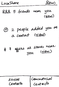
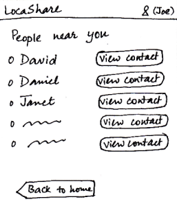
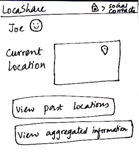
When Joe starts LocaShare,he sees
the home screen shown in the figure.
* Upon clicking the link “view” near
(i), he sees the names of social contacts
that are near his current location. By
clicking on the button “View Contact”,
he can view further details.
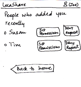
* Upon clicking the link “view” near (ii), he
sees the names of people who added
him as a contact. The relationship between
Joe and that person (e.g., Susan) is not
established till Joe also adds Susan as his
social contact. By pressing the button “Set
Permissions”, Joe can add Susan to his
list. If he does not want to share his location
information with Susan, he can choose to
“Deny Request” and Susan would not be
able to track his location (since he will not
appear as her social contact). By selecting
either “Set Permissions” or “Deny Request”,
he can remove the person’s name from this
screen.
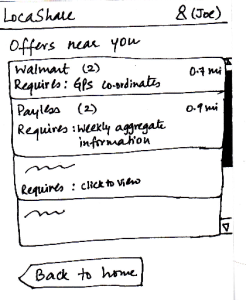
* Upon clicking the link “view” near (iii), he sees
a list containing thenames of stores that are
offering discounts or sales in exchange for his
location information.
In all the three cases, he can choose to return back to
the home screen.
|
Pros:
1. Easy to learn where
to click and how to navigate by
providing texts on the labels.
However, it pays the price
of simplicity.
Cons:
1. Back button at the bottom is inconsistent
with other mobile apps. The way
of receiving notification is also
inconsistent with other
social apps such as Facebook.
2. The user interface uses
jargons (social/commercial
contacts and GPS coordinates)
which makes hard for
users to understand. |
Pros:
Cons:
- If the list of contacts is long,
users need to scroll down on the long list.
|
The error here might be
viewing the wrong deal
or contact. Users can undo
this action by pressing the back button.
|
Pros:
The most essential
capabilities are
directly visible.
Graphical representation
of what the task entails.
Cons:
- Only numbers
are directly
visible, if you know
that someone has
added you (if they
notify you), you
still have to click the
"view" link and then
acknowledge the
relationship.
- The "view" hyperlink
does not provide
enough information scent. |
Task 1: Add Social Contacts:
|
Storyboard |
Learnability |
Efficiency |
Safety |
Visibility
|
|
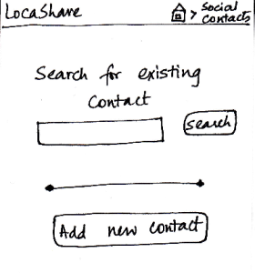
Joe starts from the home screen and clicks on the
tab “Social Contacts”. He is then taken to the screen
shown here that can be considered the “Home
Screen” to handle his social contacts. Here, he can
(i) search for an existing social contact or (ii) add a
new one.
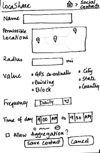
Since Bob is not on his contact list, he
selects “Add New Contact”. He is then taken to the
screen that shows the various settings he can use
to control the amount and type of his location
information that Bob can view.
He can create settings according to
what he wishes to share (in detail or
in aggregate) with Bob. He
then clicks the button called “Save Contact”. He can
also cancel the form and start it again, if he wants to.
The breadcrumb trail helps the user navigate
back to home screen of the app or home screen
of the social contacts.
|
Pros:
As in the other screens, the information scent is
strong because the user is able
to identify and keep track of which
part of the application she is in.
Providing the map option makes it easy
to learn and adapt since it is externally
consistent with apps like Google Maps and
gives the ability to directly manipulate.
Cons:
The screen does not indicate which
options are compulsory and which
may be skipped.
|
Pros:
Since all the features are
clearly labeled, user can
set the
sharing options very quickly.
Cons:
The list of options may
seem tedious for many
users.
If the user wants to share
the same type of location
with multiple users, she
will have to enter the
same details all over
again. Aggregation of
location types may be
helpful.
|
Pros:
Cons:
- Possible to make
mistakes and over-/under
share
information.
Confirmation dialogs
may be helpful.
|
Pros:
Controls are clearly visible.
Cons:
|
Task 2: View real-time location of social contacts:
|
Storyboard |
Learnability |
Efficiency |
Safety |
Visibility
|
|
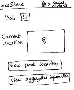
Once Bob adds Joe as a contact, Joe can
now search for Bob in his social contacts.
He sees the screen shown here that
indicates Bob’s current location (depending
on what Bob allowed him to view). Joe can
also choose to view historical locations
visited by Bob or Bob’s aggregated information.
On the similar screen on Bob’s application,
where Bob would be viewing Joe’s profile,
Bob would see that the button “View
Aggregated Information” would be disabled since
Joe did not allow Bob to view his aggregated
information.
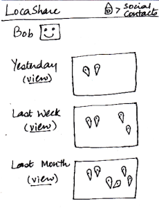
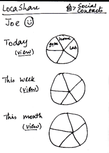
Suppose that a month has passed since Joe
added Bob to his contact list. Joe can view Bob’s
historical data by clicking on the button called
“View Past Locations”. He would then see this
screen that shows Bob’s locations using markers
on three different maps. These three maps
correspond to a daily, weekly and monthly summary
of Bob’s locations (based on the permissions
that Bob set for Joe).
The breadcrumb trail helps the user
navigate back to home screen of the
app or home screen of the social contacts.
|
Pros: Once you
Cons:
The data presented
may be confusing
to some users.
What is the difference
between history
and aggregation?
Also, if the contact
visited the same place
multiple times a
day, would there be
a corresponding
number of
keyhole markers?
|
Pros:
Cons:
Lacks external
consistency with
other mobile apps.
The user
has to explicitly
search for the
contact to be able to
view location.
Would be better if there
was an
alphabetical list of
contacts
that the user could
scroll through.
|
Pros:
Cannot edit the contact's
information, so nothing irreversible can happen.
Cons:
|
Pros:
The most important
detail (current location) is
visible in an understandable
manner in a quick glance.
Cons:
|
Task 3: View offers and opt-in to create commercial contacts:
|
Storyboard |
Learnability |
Efficiency |
Safety |
Visibility
|
 |
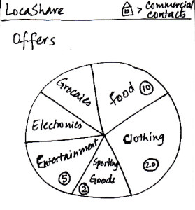
Joe starts from the home screen and clicks
on the tab “Commercial Contacts”. He is
then taken to the screen shown here that can
be considered the “Home Screen” to handle
his commercial contacts. Here, he can view
various categories of products on a wheel.
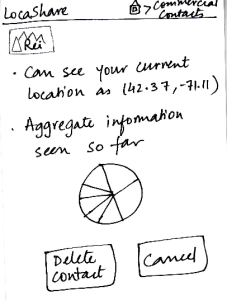
Since Joe is at
a ski resort and wants to buy some gear,
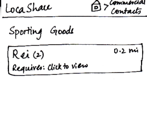
he selects the wedge titled “Sporting Goods” and is taken to the next screen that shows
him the list of stores selling sporting goods
and having offers.
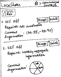
He can then click on the company providing the offers and see the details of the offers. To help Joe understand the exact information he would be sharing, LocaShare displays his
current information as an example.
Joe can choose to accept or delete the offer by pressing
the “Accept” or “Delete” buttons respectively.
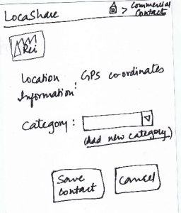
Once he accepts an offer, he
would see a summary of the information he is about to share with Rei on the screen. He can choose to create a category in which to save Rei as a
contact. He finishes the process by pressing the “Save Contact” button or cancel
the offer by clicking “Cancel”.
The breadcrumb trail helps the user navigate back to home screen of the app or home screen of the commercial contacts.
|
Pros:
Before confirming the relationship, the design gives
feedback to the user about the
location that will be shared.
Cons:
The numbers in circles could be misleading. Are they based on the number of offers in that
category? What about offers that
can span multiple categories?
Would the wheel rotate when swiped? That would be the user's model of such a construct. If
the wheel is intended to be
stationary, a list mechanism
may be far easier to learn. Also,
what do the size of the wedges
mean?
What does the wheel in the third slide mean? Users do not have default sharing settings in this
design and the user has not started
sharing with Rei yet. The label should be modified to say "sample
information"
|
Pros:
The wheel analogy of categorization of offers
seems to be useful because users can quickly navigate to the type of
offer they are looking for.
Cons:
Have to go through four
screens to establish the commercial contact relationship.
Having a search mechanism will be helpful since search is
quicker than trying to locate a type of offer that does not neatly fit into any
pre-defined category.
|
Pros:
Cons:
Users may
inadvertently over-share
information. The only way
to change this
is by deleting
the contact
relationship.
|
Pros:
The wheel structure displays
the major categories very
visibly.
Helpful information is presented in an
externally consistent
manner (e.g., distance from the user's location
to the store. this is
similar to how Google Maps
displays the location).
Cons:
|
Task 4: View aggregate information |
of social contacts:
|
Storyboard |
Learnability |
Efficiency |
Safety |
Visibility
|
 |
Since Alice wants to view Joe’s aggregate information,
she first searches for Joe on her “Home Screen”
for social contacts. She then sees Joe’s profile as
seen in this sketch. At a glance, she can see that he
is near Sunday River and so she is relived that he
reached the resort safe and sound. When she clicks
on “View Aggregated Information”, she sees the
following screen. She can see a summary of Joe’s
location on a daily, weekly and monthly basis. Instead
of a map view that showed Bob’s locations using
markers, in this aggregated view, Alice can see a pie
chart/wheel showing the amount of time Joe spent at
various places.
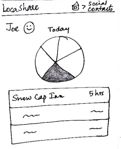
Alice can choose to drill down and get additional
details by selecting a wedge from the wheel. Suppose
that she selected the category “Campground”
(shown as a shaded region), she can see a list of
places related to “Campground” that Joe has been
to and the amount of time he spent at each place.
The breadcrumb trail helps the user navigate back to home screen of the app or home screen of the social contacts.
|
Pros:
The user would use the first
two screens to view the current
location as well, so this task is easy to understand.
Cons:
|
Pros:
Have to go through three
screens to view the
interested
data. May be helpful to
have hovering mechanisms that
display necessary information to the
user without the need
to navigate through
so many screens.
Cons:
|
Pros:
No irreversible change
can be done in this viewing task.
Cons:
|
Pros:
Cons:
The graphs do not
really
convey interesting
information.
May be helpful to show
the information on the
fourth
screen on hover (instead
of clicking and going to
another screen).
|
Task 5: Edit social contacts: |
Storyboard |
Learnability |
Efficiency |
Safety |
Visibility
|
 |
Since Joe wants to modify the location permissions
for Bob, he first searches for Bob on the “Home
Screen” for social contacts. After he comes to
Bob’s profile, he clicks on Bob’s icon/photo and
comes to this screen. Here he view the amount
and type of information that Bob can view about
<ac:structured-macro ac:name="unmigrated-wiki-markup" ac:schema-version="1" ac:macro-id="ec0a1729-c632-4929-9225-214e15f4b169"><ac:plain-text-body><![CDATA[him. [Note: Suppose that during the trip Joe
]]></ac:plain-text-body></ac:structured-macro>
allowed Bob to view his aggregated information.]
Joe can see that Bob can see his current location
as the lat/long in Cambridge, MA (his current
location). He also sees the pie chart/wheel that
describes the categorization of places that Bob
was able to view about him. He can now choose
to modify the permissions by clicking on the button
called “Modify Permissions” or can choose to
return by clicking “Cancel”. Once he clicks “Modify
Permissions”, he taken to the permissions sketch
described in task 1.
The breadcrumb trail helps the user
navigate back to home screen of the app
or home screen of the social contacts.
|
Pros:
Cons:
The task is not very easy to
learn in these two
slides, since the bulk of the editing
happens in the permissions screen.
He "clicks on Bob's icon/photo and
comes to this screen". How will users
figure that out on their own?
|
Pros:
Cons:
May be helpful to have a
"Cancel
This Option" button beside the
specific/aggregate information
display. That way, the user
does not have to go to the permissions
screen to cancel
aggregation option (for example).
|
Pros:
No irreversible
action
possible in these
two screens.
Cons:
|
Pros:
Cons:
The data that the
social contact
(user's
friend, for example)
can see is very visible
and easy to understand.
The control for editing
task is not visible at all.
|
Task 6: Edit commercial contacts: |
Storyboard |
Learnability |
Efficiency |
Safety |
Visibility
|
|
Since this task started with Joe seeing an offer from Rei,
he is led to this sketch by clicking on Rei’s icon in the
screen described in task 3 (that shows the two offers
provided by Rei). In this screen, Joe can view the
current and aggregate information that Rei is able to
view about Joe. Since a commercial contact is not
editable by Joe (it was tied to the specific offer), he
can only choose to continue sharing the information
or delete the contact. If he happens to accept
multiple offers from Rei (that require different types
and/or amounts of location information), this screen
would show a summary of entire information set
that he is sharing with that one store. In that case,
clicking on “Delete Contact” will stop Rei from accessing
any of the pieces of information it was able to access
previously.
The breadcrumb trail helps the user
navigate back to home screen of the app
or home screen of the commercial contacts.
|
Pros:
Cons:
The task is not very easy to
learn in these two slides,
since the bulk of the editing happens in the permissions
screen. |
Pros:
Cons:
May be helpful to have a
"Cancel This
Option" button beside the
specific/aggregate information
display. That way, the user does
not have to go to the
permissions screen to cancel
aggregation option (for example). |
Pros:
Cons:
What if the user wants to
share a subset of
information with Rei? This
design describes an
all-or-nothing approach.
|
Pros:
Cons:
The data that the social
contact (Rei, for
example) can see is
very visible and easy to understand. |