Charitable Connections
Group Members
- Emily Kuo (ekuo8)
- Gil O'Neil (goneil)
- Max Stein-Golenbock (msteing)
GR1 - User Observation and Analysis
GR2 - Designs
GR3 - Paper Prototyping
GR4 - Computer Prototype
GR5 - Implementation
GR6 - User Testing
Design
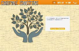
Home Screen
The home screen is where users are initially taken when they view the application. From here, you can login, create an event, or view your past events and messages.
Decisions:
We put buttons on a "well" background and provided some information about our company because testers said they had difficulty seeing the buttons. We also moved focus slightly away from the logo by moving it from the center to the left side of the screen and shrinking it slightly.
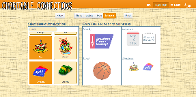
Create Screen
The create event section is where the user fills out details about their event to help us filter the businesses.
Decisions:
After feedback we decided to switch around the two panes so choices were on the left and the results showed up on the right. We edited the background of the title text to have a flat background over the hatched to make the text more readable. The images on the right were made opaque to deter users from thinking they were buttons. We eliminated the tabs in the logistics pane and instead just has an input box for the date and the map underneath. The back and next buttons were brought in line with the navigation buttons at the top to indicate the correlation between them.
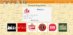
Business Suggestions Screen
This page is shown to the user after they have created their event and shows businesses that match the event based on the event details.
Design Decisions
Allow for scrolling through businesses with the scroll bar rather than needing to click next and previous buttons.
Sped up the scrolling speed if user hovers over a button
Changed how businesses are added to messages and show which businesses are on the message.
Changed message recipients to unchangeable blocks rather than an editable text box.
Display a popover about why a business matched the query if the mouse hovers over an icon
When you first arrive to this screen, the center box tells you how many businesses matched the users query (makes it seem like our application is actually helping them)
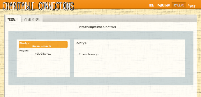
My Events Screen
Design Decisions
Tabular layout, with a white overlay on top of the hash background for better readability
Side-by-side display panes
Selectable message threads- limiting to one selection at a time; message thread selected on left displays full message body in right pane
Implementation
In terms of technology, we used JQuery-UI and Bootstrap for our front end, and Node.js and MongoDB for our backend. Our implementation mostly stayed true to our original design, with the exception of slight modifications in the Business Suggestions page. There, we changed the layout a bit, in response to some preliminary feedback and testing, to improve the efficiency of messaging.
We placed heavy emphasis on simplicity in our design and implementation. Our layouts were deliberately uncomplicated, and this strategy paid off in our user testing, as most users responded positively to the design.
Evaluation
Briefing and Preparation
We conducted our user tests in the same way as our previous testing in our conference with Jeremy. Our users were all either charity event planners or had participated in charity events, and were all therefore indicative of our user population . We first briefed our users about the problem our site tackled and the scenario behind its use.
Scenario: You are a charity event planner, looking for donations from local businesses for your event.
Tasks: Create an event in Cambridge and message two businesses asking for donations to your event.
We also performed demos with varied thoroughness for comparison. Then, for one user, we performed a demo of the full functionality of our site, including account creation, step-by-step event creation, business-results, and message sending and viewing. For the second user, we performed the same demo, except we did not show the message viewing component in My Events. And, for the final user, we did not perform a demo.
User 1
The briefing confused user 1 a bit because, but he knew that he should still click on "create event." This user's first reaction, however, was that the home page looked pretty. Upon coming to the second page, the user was confused about what to do because the briefing did was too open ended about how to create an event. He clicked the charity then to unhighlight the charity, clicked in the box on the right (which doesnt do anything). He then realized how to unselect charities. From here, he easily got through the rest of the event creation.
When he got to the next page, he chose a business and easily messaged them. Then He messaged two more by adding a business to the message.
Suggestions/Comments
The business suggestion screen should be the same as the create event screen which would be more consistent.
Said he wasnt sure initially that you could scroll through businesses and event details.
Didnt realize at first that more than one business could be messaged at the same time (severity 7/10. This is a learnability issue and could be fixed with a popover when the message screen is opened telling the user how to add businesses to messages)
User 2
This user had no problems and got through everything without help. THey did have useful comments though
Comments/Suggestions
Make sure the scroll bars are visible (this is a major issue 8/10 because she did not see all of the choices in the event creation step). This has an easy fix
User 3
The third user tested the site without a demo from us beforehand. He immediately clicked on the "Create Event" tab in the header. He had no problem choosing a charity, but after its logo appeared in the square display, he became confused. He tried to click around the logo, thinking it might be a button. Then, he tried to click the "Logistics" display square instead of using the "next" button at the top. The severity of this was a 7 out of 10. When nothing happened, he paused, looked around the page and noticed the top buttons. He ended up clicking the "Logistics" header button instead of the "next" button to continue to the logistics page. The severity of this was a 1 out of 10. In the logistics section, he entered an address "77 Massachusetts Ave, Cambridge MA 02139" instead of just a city, which drew a chuckle from him when the full address appeared, overflowing, on the welcome-sign icon. The severity of this was a 5 out of 10. He proceeded through the rest of the event-creation process without any hiccup. His reaction, when sixteen business results popped up, was "Oh, nice!" He chose the first two and successfully sent messages to them, although he did not realize that he could send one message to multiple businesses. The severity of this was a 5 out of 10.
Suggestions/Comments: He suggested that during the event creation process, the user should be automatically directed to the next step after making a selection on the current step. He also suggested that the display squares on the right that show the selections the user has made should also be clickable, and redirect the user to that step in the process.
Reflection
Overall, the project was a tremendous learning experience, and like all learning experiences, this meant doing some things right, but also making a lot of mistakes. If we had to do it again, we would have went about the design process slightly differently.
First, there were a lot of minor issues with affordances that we found in user testing, but that we didn't think of during the design process. For example, adding a visible scroll-bar to every scrollable pane would have been helpful.
Second, we would have prototyped our My Events page. We decided not to prototype this page at the time, because it did not play a part in our user task scenario. However, in hindsight, it was an essential piece of the site as a whole, and should have been designed before its implementation.
Third, due to time-constraints, we implemented only the part of the site that served the event-planner as a user. Given more time, we would have also implemented the other half of the site, for the business as a user. This would have allowed an actual exchange of messages between event planners and businesses on the site, instead of a simulated exchange.
However, there were some decisions we still feel are strong ones. We received a lot of positive feedback about the overall simplicity of the site.
1 Comment
Unknown User (jks@mit.edu)