Scenario
Amy Johnson is a retired school teacher. At 78, her favorite part of the year is helping to audit the local elections. While her eyesight is not what it was, she is a perfectionist and cares greatly about having the audit done as concisely as possible. A veteran election auditor, Amy is the leader of her pair of 2. This means that while a partner reads her the ballots, she is responsible for recording the information. Amy has found that the fastest way to get this process done is to read and record straight down the ballot (instead of reading a particular race on every ballot), and instructs her partner to do it in this way. Today, she is auditing the presidential election. There is both a presidential and senate race and Amy is very excited. She is given a stack of 50 ballots to audit.
Tasks:
- Sign in to the secure system.
- Enter 50 ballots into the system. She will enter these by ballot (i.e. enter all the votes on one ballot for every race before moving on to the next one).
- Restart counting if the total does not equal 50 (i.e. they are miscounted).
- Send the final 50 results to the audit supervisor.
Individual Designs
Storyboard 1 – Efficiency
|
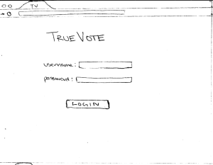
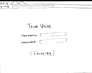
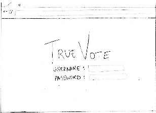
When Mrs.Johnson begins her task, this is the first scene she sees. This is just a login screen, where she can enter her username and password. When she logs in, she will be presented with her ballot-counter screen. |
|
|
|
In this design, all options are large buttons. |
|
|
|
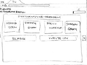
The first race of the first ballot is presented. Mrs. Johnson can then select a button. When she clicks, she will be taken to the next race on this ballot. |
||
|
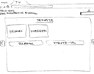
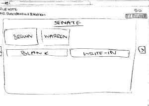
The second race of the first ballot is presented. Again, Mrs. Johnson can select a button. There are back and forward arrows to allow her to fix mistakes. |
||
|
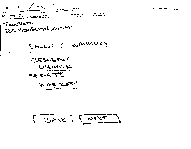
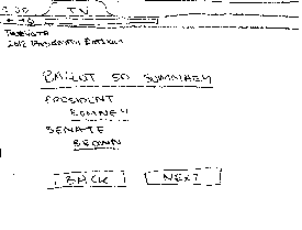
After she finishes the first ballot, she is presented with a summary screen of the ballot and the candidates she selected. She can go back to fix a mistake or just hit next to move on. |
||
|
After finishing the first ballot, she moves on to ballot number 2 and is presented with the first race again. |
||
|
She is then taken to the second race on ballot number 2. |
||
|
She hits next, after verifying the summary of ballot 2. |
||
|
Mrs. Johnson is now on the last race of the 50th ballot. |
||
|
She hits next, after verifying the summary of ballot 50. |
||
|
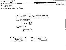
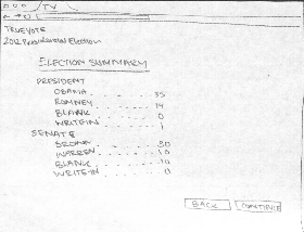
After she is done with 50 ballots, she can view a summary of the election and chose to either go back and fix her mistakes or continue. |
||
|
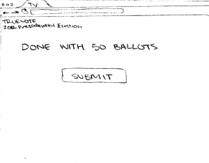
She can then choose to submit the results to her audit supervisor. |
||
|
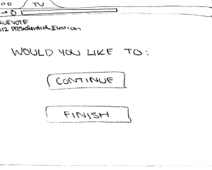
She is then presented with a screen, allowing her to choose to continue counting another set of ballots or to finish this audit. She clicks finish. |
||
|
She is taken back to the entrance login screen. |
Analysis
Of our final three designs, this one has the best efficiency.
Efficiency:
- One-click process: Because the system advances as soon as any option is clicked, the user can proceed quickly without needing to select an option and then press next. One click per page is much faster than two.
- Minimal text: The screen has minimal text, so it is easy for the user to scan the text and find the right option. This reduces the mental processing time required.
- Ballot summary: The user has to stop and review/skim each ballot before submitting it and moving on. While this decreases efficiency, it was necessary for safety (see below).
Learnability:
- Item selection: Because only one item shows up at a time, the user will quickly learn to just click the appropriate name and that the system will move on. Much of the changing between screens is done automatically, minimizing the need for users to learn system navigation.
- Minimal text: Because there is very little text on each screen, the user has very few choices what to do. This makes it easy to quickly determine the right action to take.
- Unclear buttons: As drawn, the users who are unfamiliar with computers may not understand that each candidate's name is a button. This is a problem with learnability particularly for our user class of older, non-tech-savy auditors.
Safety:
- One-click Process: Because the system advances on any click, the user doesn’t have a chance to verify that they selected the correct option, reducing the safety.
- Large Buttons: The buttons are all large, so the likelihood of accidentally clicking the wrong button will be smaller. Users will also see the button depress when clicked, so they will get that feedback about which element has been selected. These together improve the safety.
- Forward/Back Buttons: If the user makes a mistake, she can chose the back button to correct it. Error correction improves safety. The forward buttons let her navigate back to her current position without reentering information – which would increase the likelihood of making another error.
- Status Bar: The user can keep track of how far she is.If a ballot was missed or double-submitted, this mechanism will help catch that error. For example, if the user sees that she is entering the 3rd ballot, but the ballot number is 2, she knows that one of the ballots was not properly submitted.
- Ballot summary/confirmation page: the user has the opportunity to view a summary of each ballot and make sure it is correct. This is especially important because when entering the information, there is very little feedback. So having this summary greatly increases safety and the likelihood a user will catch any errors.
Storyboard 2 – Ballot metaphor
|
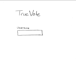
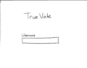
When Mrs.Johnson begins her task, this is the first scene she sees. To minimize confusion, there is very little text on the screen, just a spot for her to enter her username. |
|
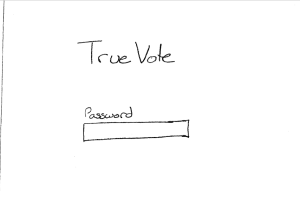
Similarly, the next page just asks for her password. This way she can be validated and she will be logged in to perform her task. |
|
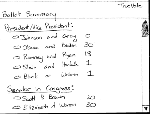
The format for this design is a similarity to a physical ballot. Hence any item with options will have the text as well as a bubble radio-button beside it. Mrs. Johnson and other users can click the button or the text to select a choice. |
|
The first ballot now shows up and Mrs. Johnson is ready to start entering ballots. |
|
Mrs. Johnson can fill out ballot number 2 in the same manner, and she continues on. |
|
Mrs. Johnson is comfortable with the system and completes ballots 3-49 in the same way. |
|
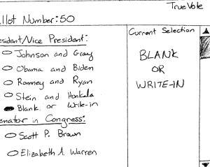
Finally, Mrs.Johnson reaches ballot #50. This one is a bit unusual with a write-in. But similar to the paper system from past years, she merely marks that the ballot had a write-in, sets the physical one aside, and moves on. |
|
Mrs. Johnson now takes a moment to look over the summary of the 50 ballots she just entered. This way she can make sure the numbers seem to align with what she was entering. |
|
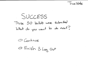
Mrs.Johnson is relieved to see that the ballots were successfully submitted. That was all she needed to do now, so she selects finish and log out. |
|
Seeing that the system is back to the home page, Mrs.Johnson is satisfied that she has completed her work and is safely logged out of the system. She's now ready to move on to her next task. |

Analysis
Of our final three designs, this one has the strongest metaphor to a real ballot.
Efficiency:
- With the presentation of the whole ballot on the page, the user has to scroll down, hindering the efficiency.
- The summary page presented to the user requires yet another step of verification.
Learnability:
- Item selection: Because a full ballot is presented to the user, it is pretty intuitive to select the candidates that were voted for.
- Metaphorical Consistency: Because this mimics physical ballots, it is easy for users to understand the layout and where to click to select a candidate.
Safety:
- Right Pane: Seeing immediate feedback on the user's clicks helps the user identify if there were any errors immediately.
- Summary Page: The summary presented at the end allows the user to quickly scan to make sure there were no mistakes.
- Forward/Back Buttons: If the user makes a mistake, she can chose the back button to correct it. Error correction improves safety. The forward buttons let her navigate back to her current position without reentering information – which would increase the likelihood of making another error.
- Ballot Count Bar: The user can keep track of how far she is. This allows tracking of how far in the process she is.
Storyboard 3 – Feedback
|
When Mrs.Johnson begins her task, this is the first scene she sees. She logs in with her username and password. |
|
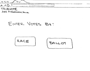
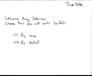
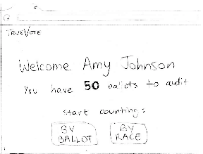
After logging in, she sees the welcome screen. This screen gives her a personalized welcome message, and informs her of the task of the day: she has 50 ballots to audit. She can choose to count these ballots by race, or by ballot (going through one complete ballot at a time). |
|
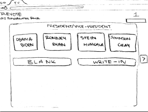
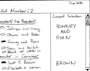
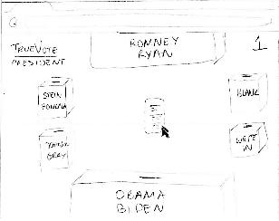
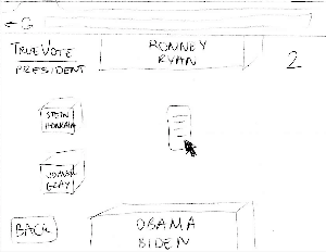
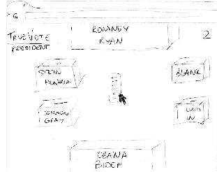
This brings her to the main counting screen. On the top left corner she sees what race she's counting for, in this case the presidential race. In the top right corner, she sees what ballot she's currently on (ballot #1). |
|
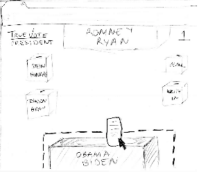
The reader tells Mrs. Johnson that the vote is for Obama/Biden. She drags the ballot and moves it onto the Obama/Biden box. When she enters the box's area, the box is highlighted by a dotted boundary and changes color to give more feedback about the action that she's about to perform. |
|
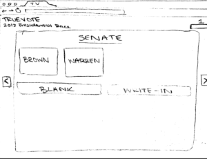
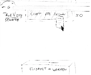
After dropping the previous vote, she is immediately taken to the next screen. Her cursor is placed on the ballot again. The top left hand corner has been updated to show her that she's in the Senate race, but still on ballot #1. |
|
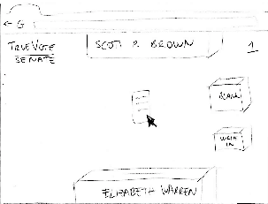
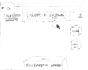
The writer tells her that the vote is for Scott Brown, and Mrs Johnson drags and drops the ballot onto the top box. |
|
The system moves forward, Mrs. Johnson will now count the votes in ballot #2. |
|
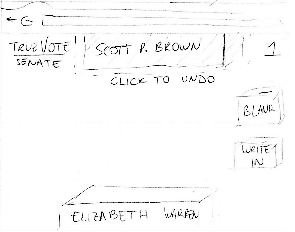
She is taken to the previous screen. In place of the ballot, the candidate's box she chose is selected. She clicks on it to undo her choice. |
|
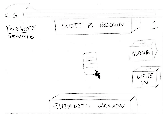
The ballot 'flies' out again, and her cursor is positioned on the ballot. The reader tells her that the vote is for Elizabeth Warren instead. |
|
She drags and drops the ballot onto the Elizabeth Warren box. |
|
Mrs. Johnson is back to counting for ballot #2 ... |
|
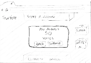
... we fast forward to the last race of the 50th ballot. She drags and drops the vote for Scott Brown. |
|
The system tells her she's completed her task for the day. She can choose to submit her audit, or go back and fix mistakes. Mrs. Johnson presses 'Submit'. |

Analysis
Learnability:
- The design has high learnability because it relies on the known task of casting a ballot into a box. Counting a vote is represented by dragging and dropping a ballot to the candidate's box.
- The design provides immediate feedback to the user for all tasks (dragging, dropping, correcting mistakes).
- The system clearly labels what race the user is counting. Candidates are labelled with large fonts, keeping in mind the older user population.
- The design focuses on providing a better user experience. The user gets personalized messages with clear instructions on the task to perform.
Efficiency:
- The layout of the candidate boxes is inspired in a pie menu. The top and bottom boxes are easier to click on because they effectively have infinite height, so they are reserved for the most popular candidates. Other boxes are easy to click from the center of the page.
- A more efficient layout could have the more popular candidates on the side. It is easier to move your mouse sideways than vertically.
- After dragging and dropping a ballot, the system moves to the next race. This speeds up the counting process, assuming the user made no mistakes.
- A big caveat in efficiency is the use of drag and drop as the main input mechanism. For a user population that averages 78 years old and is not used to technology, drag and drop is a complex motor task.
Safety:
- Safety is handled by single-error level correction. The user can go back, and with clear instructions they can undo a selection and modify a vote.
- The user has to realize that they made a mistake, and then fix an error. If they don't notice, the system will keep moving forward. A widget that shows previous selections might increase the possibility of noticing a mistake.
1 Comment
Sarah E Lehmann
Overall: Well done! Great incorporation of feedback and I'm really looking forward to where this project is going--you have some tough choices to make in the next couple of weeks with these three strong designs.
Good luck moving forward with GR3 and, as always, contact me if you have any questions or want early feedback on prototypes!