Introduction
In this phase of the project, we built the paper prototype of the interface for Beaver Buzz. We decided to use the second design as our main layout due to its innovative layout and simplicity. It would also be the ideal layout for porting to a mobile device. We integrated some of the ideas from our the other two designs as well, such as the "what's hot" label from the first design and the simple login/register from the third design.
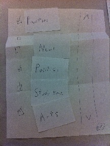
Paper Prototypes
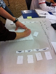
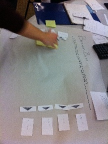
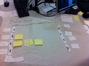
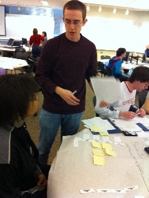
Here are some pictures of the paper prototype process done in class:
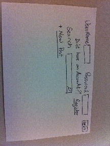
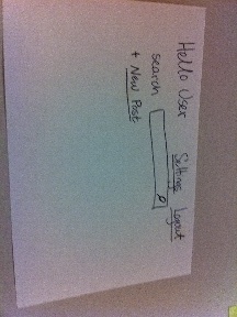
Creating the UI |
Placing Posts in UI |
Finished Paper Prototype |
User Testing Prototype |
|---|---|---|---|
|
|
|
|
Here are some of the different parts of the prototype in more detail:
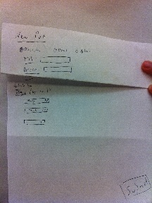
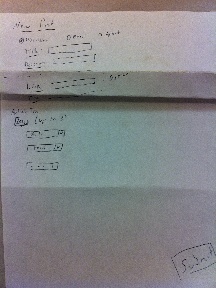
Creating an Account |
"User Corner": No Logged User |
"User Corner": Logged User |
Create Discussion |
Create Article |
Create Event |
Add Tags To Post |
Post View Page |
|---|---|---|---|---|---|---|---|
|
|
|
|
|
|
|
|


User Briefing
"Beaver Buzz is a new website for MIT students to share articles, discuss topics, and create events. It is similar to other article-sharing websites such as Digg.com and Reddit.com, but will support topics more in line with MIT students' interests. Each student with a valid MIT address will be able to make an account. They will then be able to browse topics, each of which may have three types of submissions: articles, which link to an article on the web; discussions, which functions simply as a forum; and events, which have a time, date, and event description. Note that articles and events also have a "discussion" section so people can comment on them. It is also possible for a user to post an article, event, or discussion."
Tasks
1) Create an account.
2) Click on the article called "Sports Illustrated Swimsuit Issue Released."
3) Create a new event called "Ice Cream" in the "Study Breaks" category.
4) Make the "Study Breaks" category viewable.
5) Go to "My Posts."
6) Click the "comments" section of the "Ice Cream" event.
7) Add a comment to the "Ice Cream" event.
First Prototype Observations
Overall, the users were able to complete the tasks with little problems. The following were our observations for the first prototype:
- One major problem we had was in task six. Users did not completely understand the difference between an event, an article, and a discussion. This had somewhat to do with the way the paper prototype implemented the "create new post" window. We didn't have any affordances to specify that for an event required a location, a date, and a time, nor that an article required a link. In addition, we feel they did not understand how they could interact with the different type of posts (for example, clicking an article in the main window leads to the article, but clicking a discussion in the main window leads to a "comments section" without any article).
- In this iteration we used "tags" instead of "topics." This confused the user, as they did not understand that "tag" meant the same thing as "topic." In particular, one user thought tag meant the link of the article.
- One user had a serious problem with task four and got stuck for a while. Our "add topic" icon was a simple plus sign, and he did not understand what it stood for.
- One user found the comments section confusing. In particular, she couldn't see who posted the topic, nor found it easy to view her own comments.
- One user had trouble finding the "New Post" link. Considering it was blown up and should have been very visible, this posed a problem.
Second Prototype
Changes
We didn't want to drastically alter our design since the users did not have too much trouble completing the tasks. In particular, the simplicity made most tasks very simple to complete. However, some of the above observations made it clear that some changes needed to be made. In particular, we made the following adjustments:
- "Tags" were renamed "topics" to make it clearer that these are categories.
- We added a "New Post" button next to each topic. We thought this would make it clear where the post was, and what topic the post will be under.
- We added a "viewable topics" tag to the plus sign, so it was more obvious it's for allowing one to view different topics.
- The comments section was touched up, so that it was clearer where to post a comment, and how to reply to someone. In addition, the creator of the topic is clearly visible at the top.
- For the "make post" window, we added some dynamic adjustment, so that a "link" textbox appears if you select to submit an article, and a "date and time" box appears for an event.
Observations
While things went much better this time, we still encountered some problems, both new ones and ones that were intrinsic in the initial design that we missed. These were the following
- The events-articles-discussions problem was largely rectified with our change. However, one user notified us afterward that she still didn't completely understand the difference between them. We may need to implement some kind of help toolbar to explain. While this isn't the most elegant solution, it will do away with the confusion.
- One user pointed out that we forgot a scrollbar in our main page. Thus, he didn't think he could put on more than a few topics on the main page. This is something we should have made visible.
- The "new post" idea backfired. In particular, one user did not understand that even if she clicked "new post" next to one topic, she could tag it as another topic as well, or change her mind completely and not tag it as the topic she selected originally. We should have probably put only one "new post" button at the bottom right of the screen.
- One user pointed out that there shouldn't be a difference between "home" and "what's hot." In addition, he made us realize that we didn't actually test voting for a topic. This is something we need to make sure to include in the next prototype.
- One user found that there was too much information on the screen, particularly since she couldn't tell articles apart from options. We believe this will be rectified with the use of color, however.
- One user made the good point that he should be able to reorder topics in the main window. While we're not sure if we'll do that, we'll have to organize the topics in the "select viewable topics" window.
Conclusions
We've decided to stick to our initial design. While there were a few problems, we believe that they can be rectified with better information scent and visibility. We appreciate the simplicity of the design, and the fact that it could be easily displayed on a mobile screen. We will need to fix some of the design issues we encountered. Most notably, we need to make the interface somewhat more learn-able and make the items on the screen more visible. We believe that most of these problems can be fixed in the actual implementation by the use of color and widgets.
1 Comment
Tsung-Hsiang Chang