Charitable Connections
Group Members
- Emily Kuo (ekuo8)
- Gil O'Neil (goneil)
- Max Stein-Golenbock (msteing)
GR1 - User Observation and Analysis
GR2 - Designs
GR3 - Paper Prototyping
GR4 - Computer Prototype
GR5 - Implementation
GR6 - User Testing
GR2: Designs
Scenario

Bartholomew is an animal lover. He decides he wants to raise money for an animal shelter near his house. He figures that the best way to do this will be to plan an event. Of course, he wants his event to be as successful as possible, which means getting as many attendees as possible and making the experience fun. He loves cooking and thinks a cooking event would be fun. He considers different options for events related to cooking and decides to do an iron-chef themed cooking competition. He realizes that he will need ingredients for the participants to cook, a kitchen to host the event, kitchen tools, as well as prizes for the winners. He’s not sure where to get all these things, so he begins by looking for cooking-specific businesses to donate to his event.
Bart will need to:
- Create an event
- Start a business search
- Find how to connect with the business (phone, email, messaging etc)
The order of 1 and 2 is arbitrary.
Individual Design Sketches
Emily's Sketches:
Sketch 1:
The first sketch I did attempted to portray how I thought this problem would be approached without a computer. There would have to be a database of businesses for the user to look through. My idea was to have a box for each location and each box would be sorted into three sections based on business size.
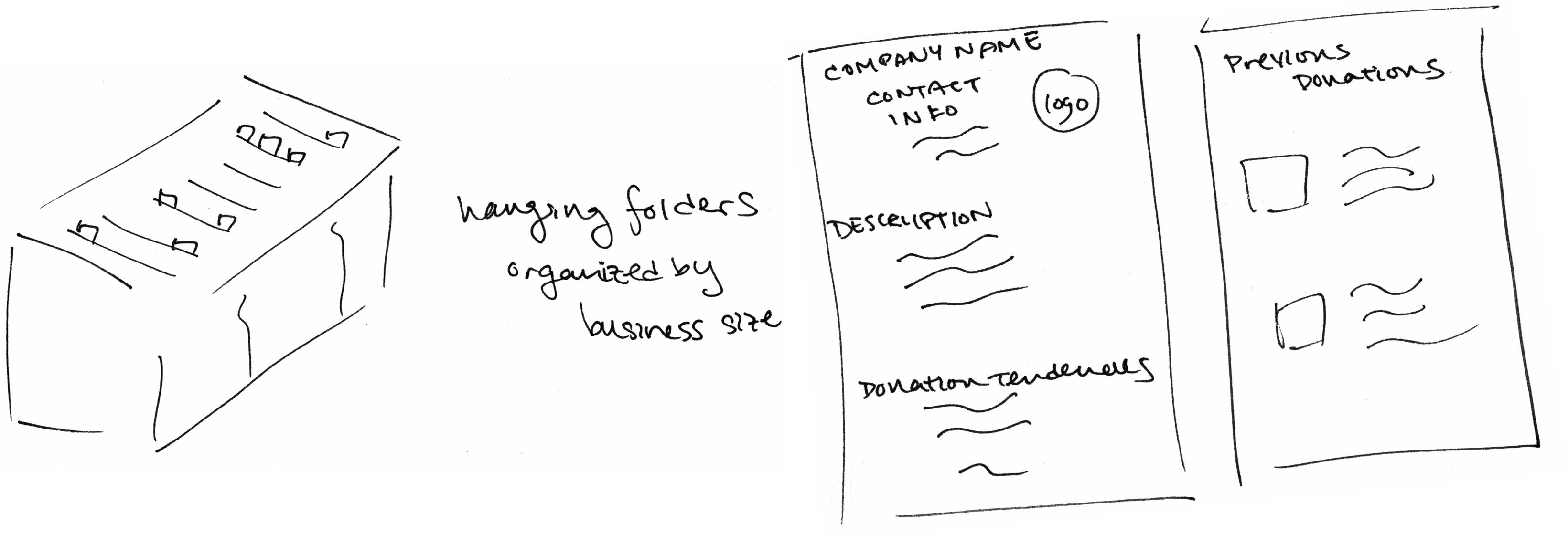
Each folder would have a number of labels each indicating the types of charities that they usually donate to. Within the size groups the folders are sorted by their donation flexibility of charity types. That is, those businesses that only donate to one type of charity will be on one side, while the businesses that donate to many types are on the other. In each folder it would contain the business info and past donations.
Sketch 2:
The second sketch was a flexible website that allows for two options of finding companies. One way would be to create an event with details and a filtered list of businesses would pop up on the side. The second option was to allow the user to just browse the whole list of companies. They would be able to group the companies based on different properties (e.g. Type, Location, Name, etc.)
|
|
|
|


The third tab on the screen was to help the user outline their pitch to the company. It just asks a series of questions to the user, so they can bring it all together into one coherent pitch. The fourth scene is an example of what the company would see. They would build their profile with company info, also indicate whether they are accepting donations at a certain point, and what they have left of their budget. In both case for the user looking for companies, when they clicked on a company they would get the information filled out by the business in the fourth screen.
Sketch 3:
The third sketch I made was supposed to be very visual, possibly targeting people who wanted to only visit businesses nearby. The idea was just to have a map with all the information a user would need.

There are filters that allows the users to only see certain types of businesses. To make the map more readable at a glance, each location would have symbols indicating what type of business it is, after mousing over you could see more info, which would also mostly be presented as images.
Gil's Sketches:
Sketch 1:
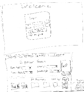
In my first sketch, I attempted to design for efficiency. The idea being that most people who use our site would be interested in searching for business connections and creating an event would be a secondary thought. The screens are laid out as follows:
- Login screen (or login as guest)
- After login you are directed to the Sponsor Search
- Have choice to input things useful to events (event type, donation type, charity, event scale)
- After hitting search, the screen updates and summary panes of businesses are shown below
- Search/filtering options available and are buttons (not drop-down) for efficiency.
- Business pane expanded
- at a glance summary of business with words of interest highlighted and donation goals bar graph showing how far from the quota the business is
- Option to create event is displayed on the search page and clicking that button autofills several fields in your event for better efficiency. (creating an event would be similar to saving a search)
Sketch 2:
I attempted to make my second sketch for small screen users. The buttons are very large and not too much info is displayed on any screen.
The process is as follows:
- User loggin
- create event screen
- business search
- Clicking on business displayed in slideshow brings you to business profile w/ several options
Sketch 3:
This design was more focused on the business side of things. I tried to make it easy for a business to quickly add their business.
Process:
- Login screen (login required)
- Choose business or client (if first login)
- Create your business. If you are getting too many requests, you can move the slider to show that you have exceeded your donations limit. This will let clients know that you are not accepting requests.
Max's Sketches:
Sketch 1
For my first sketch, I focused on the landing page. I wanted to design for a small-screen using large images to guide and interest the user. I designed the home page to display the major features of our site in a balanced layout.
________________________________________________________________________________________________________________________
Sketch 2
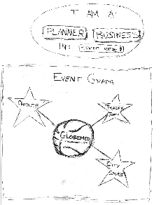
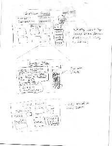
For my second sketch, I wanted to make a simple landing page with two models, one for the business as a user and one for the event planner as a user. The user would start off in the top screen by selecting either business or planner and entering location from a pull-down list. The planners would be redirected to an event-creation page and the businesses would be redirected to a business profile creation page.
I also wanted to play with the idea of a graphical display for our client connections. I wanted our site to play around with the theme of connections by showing a graph of our actual current network, including all charities and businesses that used our service and the connections between them. In this example, I chose to represent the graph of a single event. The event was a basketball tournament for GlobeMed, sponsored by Trader Joes, City Sports and Chipotle.
________________________________________________________________________________________________________________________
Sketch 3
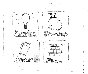
For my last sketch, I outlined a view of a possible homepage for users to see. There would be tabs for each main section of the site: events, businesses and planners. In the events section, users could view past events as inspiration and motivation. They could also see current events in the planning stages in their location, so that they could contact and get involved with these events. Users could also view a history of their past connections (businesses
The landing page for this design showed the two main features of our site, browsing businesses and creating events, as well as a visually appealing graphic.
The graphic was a representation of our business and charity connections network in the form of a graph. Charities and business would be represented by nodes of different shapes, and when a business sponsors an event for a certain charity, there would be an edge between that business's node and that charity's node.
Designs, Storyboards, and Analysis
Client Facing Designs
Design 1
Design 2
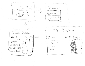
In our second design we had illiterate users on our minds. Although we couldn’t think of how exactly we would be able to make our application usable for illiterate people, we used that as a basis of the overall design. The result was a design heavily based on images and also taking from the Domino’s build a pizza application. We have four steps for the user to go through to create their event.
- The user picks their charity and will see the logo and name appear in the event snapshot. If the charity is not in the database, only the name will appear. In this case to ensure that there is some business filtering at this step, we ask for the category of the charity. A small icon will appear in the snapshot to show the category picked.
- The second step is labeled event types but it’d be more appropriate to call it event themes. The user will be able to select what type of event they are planning to hold based on different themes. In this case Bartholomew would select cooking and competition. Our thought is to populate this list by popularity and add more images if the requests come in.
- The third step just allows the user to fill in the logistics of the event, like location, date, and size.
- Many businesses prefer to donate to local causes so it’s important to filter businesses by location.
- Depending on the business size they require requests to be made a certain time before the event is to take place, so date is required to filter out businesses that cannot fulfill a request with short notice.
- When size is chosen the snapshot will populate with people according to the size chosen, and it will help to filter businesses that may not be able to make donations for a certain size event.
- The forth step involves details about donation requests. This is the most optional step, but will help to narrow down businesses if filled out. There is a slider to choose donation value and images that can be selected to show donation type. As before images will populate the snapshot according to values chosen.
|
|
|
|
|
|


Design 3
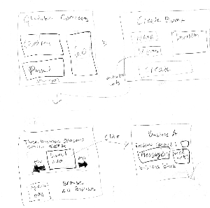
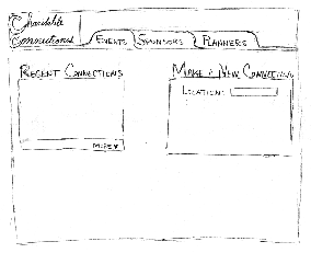
For our third design, we aimed for the opposite end of the spectrum from our first design. Where our first design took all the control out of the user's hands with a wizard, we wanted to put all the control back into the hands of the user with this design.
For this model, we decided that each business would have two important attributes: points and quota rating. A business would earn points for donations. Larger donations would earn more points. So, points would reflect the frequency and size of a business's donations. The quota rating would represent how much a business has donated thus far compared to its donation quota. So, a business that has a large quota rating is probably more willing to donate than a business with a low quota rating. If a business has reached its quota, it has zero quota rating and is probably unlikely to donate any more.
The browse businesses page was inspired by yelp's search results page. A user could filter results by relevant criteria such as location, size, points. The businesses would populate a list underneath the filters, with each business having its own row to display information. If a user is logged in, then clicking on a "connect" button below the business would pop up a message dialog box so the user could contact this business about donations. If the user is not logged in, then clicking on the "connect" button would show a preview of the message functionality and prompt the user to log in or make an account. These messages that the user could send would be filtered by our system so that only legitimate requests could actually reach a business. This feature addresses the complaint that several businesses raised in our interviews of being overrun with requests to donate.
The create event page would be similar to our last design, for an illiterate user. We think that design provided a simple, interactive and interesting interface for the user.
would see charities and event planners, and event planners would see businesses that sponsored them).
Business Facing Designs
From our interview, it did not seem like businesses ever look for people to give to. It is usually the event planners that need to approach the businesses. The problems that the businesses seemed to face were:
- Too many donation requests
- Cause of event not matching that of the business
Design 1:
Design 2: